SellersSign&Design
New Member
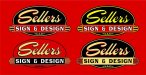
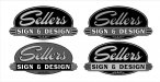
I have been using several logos over the past couple years for my business. I am working on getting some nice polo shirts embroidered, so I figured now would be a good time to settle on one logo that I can use from now on. The reason I have put this off for so long is I just cannot draw up a logo I am happy with. I have worked on several and always seem to hit a dead end. My business almost exclusively caters to fire departments, so I would like that to be represented in the logo (whether it be a shape or gold leaf). Also, most of my work has an older "retro" style to it, so I think that should be another part of the logo. With everything I want in mind I came up with this tonight. It is nowhere near finished, but for once I feel like I am on the right path. I would like to get some feedback on what I have so far, and also some opinions on the colors in the logo. I will be using a combination of red and black shirts, so the logo needs to look good on those colors. I do a lot of gold leaf work, which is why most of the lettering has a gold leaf texture. I realize that gold leaf cannot be embroidered, which leads to another problem... just go with gold thread or switch to a different color? All opinions will be greatly appreciated!