-
I want to thank all the members that have upgraded your accounts. I truly appreciate your support of the site monetarily. Supporting the site keeps this site up and running as a lot of work daily goes on behind the scenes. Click to Support Signs101 ...
You are using an out of date browser. It may not display this or other websites correctly.
You should upgrade or use an alternative browser.
You should upgrade or use an alternative browser.
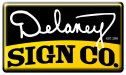
New logo for myself.
- Thread starter visualeyez
- Start date
visualeyez
New Member
PS, my corner radius is crap.
visual800
Active Member
drop the period after Co. Take some weight off bottom font and make it smaller its crowding bottom. and on the shadowing I would make that a solid shape instead of the airbrush look, shadows are not black only a darker hue of the color itself
Other than that I dig it. It looks kinda old school
Other than that I dig it. It looks kinda old school
neato
New Member
drop the period after Co. Take some weight off bottom font and make it smaller its crowding bottom. and on the shadowing I would make that a solid shape instead of the airbrush look, shadows are not black only a darker hue of the color itself
Other than that I dig it. It looks kinda old school
I think since it does look Old School, he should keep the period after CO. I like it.
visual800
Active Member
I think since it does look Old School, he should keep the period after CO. I like it.
Well thats true, sir.
I personally cannot stand periods behind something that we know is an abbreviation. Like INC. or my all time favorite L.L.C. I prefer they just completely dropp the LLC all together BUT they think by not putting in on their signage it indicates they are not LLC, lol
grafixemporium
New Member
Scripts for logos... not a great idea. If you just have to use a script in an effort to evoke a certain feeling, choose (or make) one that is cleaner, bolder and easier to read.
If you stick with your script, at least clean it up. You would never see those line inconsistencies in a real logo.
If nothing else, please lose the bevel. There is nothing about adding a bevel that makes you look like a designer who is on top of styles and trends.
Good luck!
Andrew
GFX Wraps
If you stick with your script, at least clean it up. You would never see those line inconsistencies in a real logo.
If nothing else, please lose the bevel. There is nothing about adding a bevel that makes you look like a designer who is on top of styles and trends.
Good luck!
Andrew
GFX Wraps
GaSouthpaw
Profane and profane accessories.
Is that a script? I thought it was a signature.
Personally, I'm not a fan of the arched text at the bottom, but I think you're on the right track.
Personally, I'm not a fan of the arched text at the bottom, but I think you're on the right track.
visualeyez
New Member
My thinking is that I make Signs, not Company's. Everybody knows that a business is a company right? This lets me keep the word SIGN as big as possible in one line. I also like the way that "Sign Co." rolls off the tongue...
Agreed the bevel is ugly, it was just helping me visualize it as a domed-gel decal I could put on all of my finished work.
Thanks for the input, I will adjust and re-critique.
Agreed the bevel is ugly, it was just helping me visualize it as a domed-gel decal I could put on all of my finished work.
Thanks for the input, I will adjust and re-critique.