• I want to thank all the members that have upgraded your accounts. I truly appreciate your support of the site monetarily. Supporting the site keeps this site up and running as a lot of work daily goes on behind the scenes. Click to Support Signs101 ...

Possible to apply Braille and tactile lettering directly to the wall?

ikarasu

Active Member
If you've ever done braille before...you know that the beads are friction fit, And you need a damn near 100% perfect in size and depth hole in order for the beads to stay in. I've tried to do it on my laser, and it takes forever to get it dialed in on each material / color to fit perfectly... Laser people get around this by putting double sided sticky tape and taping the beads in, but I don't see that working for drywall....

Just tell him its not impossible... let him go somewhere else to have it done, its a headache waiting to happen.
 

tulsagraphics

New Member
Had an architect with a similar big brain idea, all the signs were matched to the interior paint and mounted with quicksnaps for a floating look, with characters cut out. Install was a pain, as each sign has 4 mounts that had to be drilled and anchored, otherwise the snaps would pull the backs portion off the wall.
View attachment 168332

Interesting... Having those pictograms cut out seems like a hazard. Folks running their fingers around to find the braille and getting a finger stuck / cut. Personally, I'd probably do a reverse print on clear acrylic, leaving negative space for the pictos, then processing the letters and braille like normal.
 

tulsagraphics

New Member
The Braille would just drop out of the gypsum or get pushed into it.

You could do a tactile strip with Braille inserted into the strip.... But then you'd still be limited too only a 1" piece of tape holding it up.

Imo, bad idea.
I've looked for tactile strip / badge suppliers in the past (for a retrofit job), but every supplier I came across stated their strips weren't ADA compliant... or at the very least.. they couldn't guarantee that an inspector would approve it.
 

pro-up

New Member
Tell the architect it will cost approximately $1220 p/sign (or whatever margin would make it worth your time) for a 4'x 8' sheet of p99 acrylic brailled and subsurface painted the color of their wall. Thereby giving them the "wall" they are seeking. Tell them that does not include installation. Never tell an architect you cannot do something. Just price it accordingly and always offer them solutions and alternatives (value engineered). Good luck!
 

Superior_Adam

New Member
Had an architect with a similar big brain idea, all the signs were matched to the interior paint and mounted with quicksnaps for a floating look, with characters cut out. Install was a pain, as each sign has 4 mounts that had to be drilled and anchored, otherwise the snaps would pull the backs portion off the wall.
View attachment 168332

with the characters cut out would this not be ADA compliant. I have not checked in a while but we used to do a lot of ADA and the wording and symbols were to be raised at 1/32" thickness.
 

HightechDFW

New Member
Anyone holding the ADA certification for making signs with braille will tell you that you can't do this and be compliant. There are ways you can use super glue to keep the dots from falling out, for surfaces the braille in not meant to be in. What exactly are they trying to accomplish? If it is a wayfinding purpose, braille is not required. Those signs are required to have a high contrast background to text color and a minimum text height of 3" or 4" I believe. Signs with braille are installed in a specific way, that someone who is visually impaired knows where to touch at a certain height and specific side of the door frame from the hinges. I read that over 80% of blind people don't read braille which is the purpose for the raised lettering that goes with it. Hoping I am not off subject and have given some helpful info. This is my first post here. I think I like this group.
 

FASTSIGNS

New Member
While the cutout pictogram sign looks cool...it is not ADA compliant. The pictogram must be tactile. As far as braille on the wall, I seem to recall that the braille strips were not ADA compliant (although I can't for the life of me remember why).
 

Gino

Premium Subscriber
This was told to me about 25 years ago. Not many people read braille and this #2 style is an abbreviated form of braille that not many can read anyway. So, if 4,000 people are blind, about 10% can read braille..... and only about 10% of them can read this abbreviated braille. So, all of this for maybe 40 people, who might not ever go there or need all these ramps.

Not to sound callous, but how often do you see a totally blind person wandering through a hotel or a hospital getting around by feeling these things ?? They're almost always accompanied by someone or plenty of people who will help them and guide them.
 

gnubler

Active Member
This was told to me about 25 years ago. Not many people read braille and this #2 style is an abbreviated form of braille that not many can read anyway. So, if 4,000 people are blind, about 10% can read braille..... and only about 10% of them can read this abbreviated braille. So, all of this for maybe 40 people, who might not ever go there or need all these ramps.

Not to sound callous, but how often do you see a totally blind person wandering through a hotel or a hospital getting around by feeling these things ?? They're almost always accompanied by someone or plenty of people who will help them and guide them.
Never. I can't even remember the last time I saw someone walking out in public alone with a white cane. The world is too crowded and condensed now. I'm guessing anyone who's legally blind goes out and about with someone who can see and guide them around.

I did some braille directory signage for an office building and have seen the tenants take it upon themselves to swap out the ADA compliant printed insert with their own, stick labels over the braille, etc. It's useless.
 
Had an architect with a similar big brain idea, all the signs were matched to the interior paint and mounted with quicksnaps for a floating look, with characters cut out. Install was a pain, as each sign has 4 mounts that had to be drilled and anchored, otherwise the snaps would pull the backs portion off the wall.
View attachment 168332

That is out of compliance. The pictogram must be raised not indented. Here is the link, scroll down a bit you will find it. https://www.access-board.gov/ada/guides/chapter-7-signs/
There are people out there who sue places for non compliance. Once had to replace all the signs in a college because they got sued and lost the case.
 

bowtievega

Premium Subscriber

Visual and Tactile Requirements on Single Sign​


Tactile signs must have raised characters that are repeated in Grade 2 braille. In addition, they are subject to requirements for non-glare finish and color contrast for visual accessibility. Other information provided in addition to permanent room or space labels is not required to be raised or brailled but must meet visual criteria if informational or directional. Some information on such signs may be exempt, such as occupant names.

Pictograms​


[§703.6]
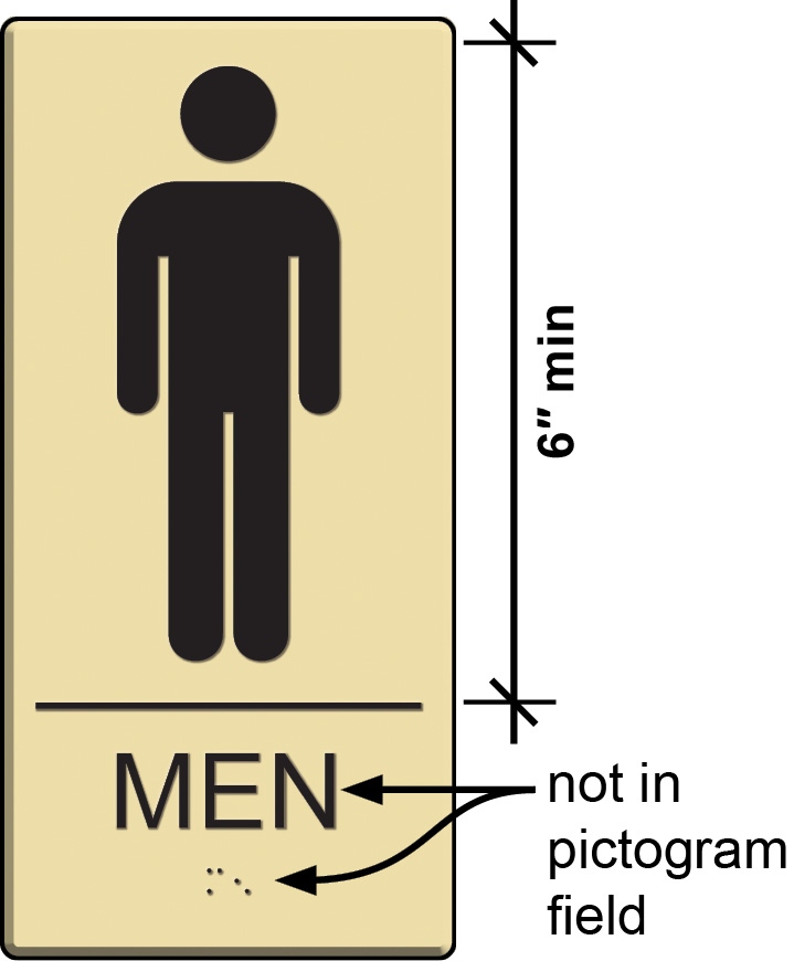
Men's restroom sign with pictogram with dimension lines identifying pictogram field and location of raised characters and braille.


Begin image notes.
6″ min height of pictogram field.
Raised characters and braille not in pictogram field.
End image notes.

The Standards do not mandate the provision of pictograms other than the symbols of accessibility, which are informational pictograms. Where other pictograms are included on a sign to designate a permanent room or space, text descriptors in raised and braille characters are required directly below the pictogram field. The pictogram is not required to be raised. The pictogram field must be at least 6 inches high. (This applies to the field, not the pictogram itself.) The pictograms and fields must have a non-glare finish and a light-on-dark or dark-on-light contrast.

Note that these requirements apply to those pictograms that label a permanent room or space, such as a restroom, cafeteria, or stairway.


According to the info in the link provided in the previous post, pictograms are not required to be raised. Typically we make them raised just because it is easier sometimes to just make all the graphics in one step instead of producing two different types of graphics and applying them separate. Am I off base here?
 

JBurton

Signtologist
The pictogram is not required to be raised.
That was the reasoning they used, I told them they may not be compliant, they said the bathrooms weren't 'publicly accessible areas' in the first place, after a whole lot of back and forth I just did as I was told. Most ADA signage lawsuits are settled by bringing the institution into compliance, as there isn't often a way to prove damages because you couldn't read a sign.
The real ADA lawsuits are ramps, that's where the real money's at!
 

gnubler

Active Member
^^ From that article:

Originally scheduled to open in 2009, the construction of the Hunters Point Library was plagued by cost overruns, construction delays, an overly grandiose design by celebrity architect Steven Holl and other problems for more than a decade. At one point, the project was paused due to a dockyard strike in Italy, so the specially designed glass panels for the building’s sculpted exterior could not be shipped to Queens on time.

LOL at architects. The arrogance. After this debacle I wouldn't mind seeing this guy do a Peter Pan off the roof of the library.
 

Gino

Premium Subscriber
I hope you realize that these signs aren't just for patients, customers or just some blind person in off the street. These places might have a blind person working there, so that stuff needs to be in-place out for the pubic and in the back for the workers. Found that out the hard way many years ago. Doing a new wing at a hospital and didn't think the laundry room, linen rooms, electric panels and other sh!t needed to be ADA. W R O N G ! ! ! They do.
 
Top