mim
0_o
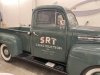
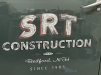
I did this job recently and I thought it was pretty cool. Curious what others think. The goal was to replicate worn off painted lettering with vinyl. The old timer at my job said only real sign painters will know what I got wrong, can you tell?  (kinda dreading finding out all the other things I might've done wrong haha)
(kinda dreading finding out all the other things I might've done wrong haha)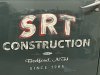

 that edit you did looks great, noted for next time.