-
I want to thank all the members that have upgraded your accounts. I truly appreciate your support of the site monetarily. Supporting the site keeps this site up and running as a lot of work daily goes on behind the scenes. Click to Support Signs101 ...
Search results
-
Extending text over frame
I could see myself liking it... but at first glance I don't... and I figured out why... I think the whole layout might be just a little too crowded. Won't know till I see it, but the rose looks slightly too big, and the number & lettering below all seem to fill the available space, with almost...- iSign
- Post #4
- Forum: Designs & Layouts
-
-
Can't Believe I Fell For This Scam!!
damn... all dressed up, and no place to go... or stay ...hmmm :omg: believe it? I think not getting "I don't believe it", put's me there already ;)- iSign
- Post #13
- Forum: General Chit-Chat
-
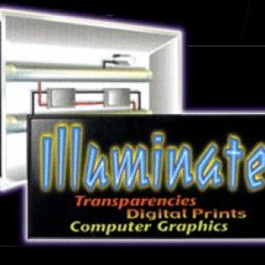
still need cheap interior lighted box - LIKE THIS:
I've seen these, and now I found a source... but the source claims to be a 'manufacturer" but handles his phone calls & his ability to return calls (or lack thereof) like some home based web reseller... so, I don't trust them, AND I think they are overpriced... BUT I NEED THIS!!!! IDEALLY...- iSign
- Thread
- Replies: 6
- Forum: General Chit-Chat
-
Can't Believe I Fell For This Scam!!
annnnd... this is why you'll no longer be able to stay home anymore either :wink: RUH ROH!!! - - - - - - - (I just don't get the "I can't believe" part though???)- iSign
- Post #8
- Forum: General Chit-Chat
-
Copyright Violation Question
And at least 36 must have been us :)- iSign
- Post #98
- Forum: Business Management
-
-
Female Advice
hell, that might have all been the best advice already... but damn if it don't seem 10 times better in your voice gg! :birthday::thumb::rock-n-roll:- iSign
- Post #36
- Forum: General Chit-Chat
-
-
Copyright Violation Question
well Adrian, I hope your written "release of unlimited usage rights" document didn't show up at Jason's mailbox either :popcorn:- iSign
- Post #72
- Forum: Business Management
-
Copyright Violation Question
this is EXACTLY why the specifics of the design ARE relevant to this discussion... you OWN copyrights to YOUR creations WITHOUT a paper trail... to take over rights from an artist, THAT is where the paper trail needs to begin... to protect THEM from someone saying they have no right to the...- iSign
- Post #55
- Forum: Business Management
-
confused about tiny incised lettering... "engraving fonts" ?
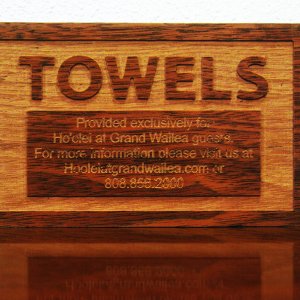
plan was to see how much contrast just from the wood itself... so for now, it's done... good night!- iSign
- Post #28
- Forum: Laser Cutters
-

waileasign
- iSign
- Media item
- Comments: 0
- Album: Member Album by iSign
-
confused about tiny incised lettering... "engraving fonts" ?
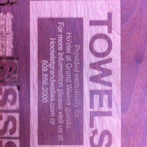
nope... never heard of that gary... but I sorta got that part working for the moment.. have you ever seen these unpredictable round bites out of the letter? It's at least a 1/4" diameter section of a circle crossing inside of where any tool path shows on my file... but I'm using an 1/8" bit...- iSign
- Post #27
- Forum: Laser Cutters
-
confused about tiny incised lettering... "engraving fonts" ?
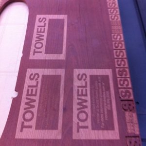
arrrgghh 8:30 pm, and I haven't even had lunch.. 3rd attempt... same glitch (upside down pic... oh well, you get the idea... the 4th "spot" has some nasty cracks I need to avoid) time to get milling... maybe lock up & grab a bite to eat while it resurfaces this board...- iSign
- Post #25
- Forum: Laser Cutters
-
confused about tiny incised lettering... "engraving fonts" ?
I hope so I just revised the text in illustrator, with an inline to make it slightly less bold, giving more room for the tool to pass between the kerning, and creating entirely new vectors.. the slab has room for one last try before milling down to a thinner slab, so I'm running that test now...- iSign
- Post #24
- Forum: Laser Cutters
-
confused about tiny incised lettering... "engraving fonts" ?
well, another mystery that has plagued me at random intervals has cost me a few vocal chord cells this evening... perfectly un-blemished vector contours, with an entirely normal toolpath display, will suddenly result in a bite being taken out of my letter. I ran just the "S" almost 10 times in...- iSign
- Post #22
- Forum: Laser Cutters
-
confused about tiny incised lettering... "engraving fonts" ?
ok... I thought I had it... I got the phone number to run nicely by using a "router offfset" function with the "open contours" checkbox checked... until I saw that it would have skipped the dots, which were closed contours... so I kept those toolpathed as an "engrave" function... and it ran...- iSign
- Post #21
- Forum: Laser Cutters


