-
I want to thank all the members that have upgraded your accounts. I truly appreciate your support of the site monetarily. Supporting the site keeps this site up and running as a lot of work daily goes on behind the scenes. Click to Support Signs101 ...
You are using an out of date browser. It may not display this or other websites correctly.
You should upgrade or use an alternative browser.
You should upgrade or use an alternative browser.
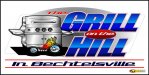
4x8 Banner
- Thread starter Showtime19
- Start date

SignManiac
New Member
Not bad and what signmeup said. I would have preferred hotter colors instead of red white and blue in the name. oranges, reds and yellows. the font choice for the towns name is hard to read too.
Last edited:
weaselboogie
New Member
the whole thing is looking squished. If those are custom wheels, they should have been drawn squashed down, not squashed via your program.
laserman70
New Member
Like the idea...
Fonts are not right. Find another font that will work without stretching them.
Love the rest.
Fonts are not right. Find another font that will work without stretching them.
Love the rest.
CustomKR17
New Member
Wow, you guys are Hyper-Critical.... Joe, I'm guessing that's going up at Grandview?? I think it's killer and hope to see it there sometime....
Red Ball
Seasoned Citizen
Way too cluttered. If I can't read it from the thumbnail it's probably not going to work as a banner. Open it up and my eyes don't know where to focus first. Colors, composition, typeface choice all need work.
Agreed.
phototec
New Member
Nice job on the grill artwork, however the clip art flames don't match the grill, would have been better with more realistic flames.
The black shadow is too dark, tires blend into shadow, a dark gray shadow with a soft edge would have been better.
Tires are stretched (like text), not round.
As mentioned, the stretched type is hard to read.
One more thing, the very thin light gray hair-line is to light and does nothing for the overall design.
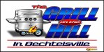
I made some quick modifications to express my points, the second image, it still needs more work.

The black shadow is too dark, tires blend into shadow, a dark gray shadow with a soft edge would have been better.
Tires are stretched (like text), not round.
As mentioned, the stretched type is hard to read.
One more thing, the very thin light gray hair-line is to light and does nothing for the overall design.
I made some quick modifications to express my points, the second image, it still needs more work.
Attachments
mountaingraphic
New Member
Really nice work!