-
I want to thank all the members that have upgraded your accounts. I truly appreciate your support of the site monetarily. Supporting the site keeps this site up and running as a lot of work daily goes on behind the scenes. Click to Support Signs101 ...
You are using an out of date browser. It may not display this or other websites correctly.
You should upgrade or use an alternative browser.
You should upgrade or use an alternative browser.
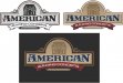
American Building logo concept
- Thread starter Pinfinity
- Start date
Speedsterbeast
New Member
When asking for feedback the goal is to find obvious broken rules regarding design, layout, kerning etc. Then we look deeper for things that we tend not to like, either personal opinion or trends that we like or dislike. I couldn't find a thing. As far as I'm concerned; you're done. Nicely done.
J Hill Designs
New Member
my only critique is that the A's in that font are a bit hard to make out. you can tell what they are due to context, but yeah.
looks good though
looks good though
Conceptually, I think it looks great and you should feel really good about it. My initial observations about it are that the house and rounded top size are a bit big while the "American" text feels cramped just a tad in its dedicated "panel". The "we build relationships" banner and text is crowding the ribbon banner above it and could either be moved away a little or done away with and have another rounded extension of your top half circle come down behind the ribbon banner with your "we build relationships" text float in that. An italicized font for that slogan might loosen things up a little too.
Is the "A" the only character with flourishes like that in the font set? Is there a non-flourished "A" included with the font?
Is the "A" the only character with flourishes like that in the font set? Is there a non-flourished "A" included with the font?
Marlene
New Member
it looks nice but I'm not sure what they do as it says building concepts and we build relationships. the we build relationships means nothing to anyone and they might want to consider getting rid of that. the building concepts could mean they design buildings but it doesn't say they build them. the design looks good, what it lacking is info on their part as to what they do
JgS
New Member
I think it's beautiful. I just also think you have too much going on in it. Unless the customer really wants the tagline on the logo I would remove it. Also I think the house is either too light or too big but it feels like it is half way between being a prominent part on the design and an accent. I think it needs to be one or the other.
shoresigns
New Member
We build relationships? Do they want customers to invite them over for BBQs and send them Christmas cards? I'd rather hire someone who builds buildings.