-
I want to thank all the members that have upgraded your accounts. I truly appreciate your support of the site monetarily. Supporting the site keeps this site up and running as a lot of work daily goes on behind the scenes. Click to Support Signs101 ...
You are using an out of date browser. It may not display this or other websites correctly.
You should upgrade or use an alternative browser.
You should upgrade or use an alternative browser.
bar logo - help
- Thread starter stephenj148
- Start date

stephenj148
New Member


ucmj22
New Member
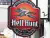
did some sketches, trying to force connect the beer tap into the letters, working or no?
From the thumbnail the tap looked like a mortar and pestil. I would try something other than Gotham. It works for Obama, but not for this.
lexsigns
New Member
like!!!How 'bout some hipsters?
stephenj148
New Member
From the thumbnail the tap looked like a mortar and pestil. I would try something other than Gotham. It works for Obama, but not for this.
its not gotham, but will try different fonts
Malkin
New Member

From the thumbnail the tap looked like a mortar and pestil. I would try something other than Gotham. It works for Obama, but not for this.
Pestle
ucmj22
New Member
Pestle
Autocorrect fail
Williams Signs
New Member


Jillbeans
New Member
On your original, the kerning bugs me.
It's also very ho-hum and almost too upscale looking for a dive bar, as you call it.
Adding wood grain etc can't tart it up.
Here's a REAL quick idea using older fonts and a beer barrel.
I think the tap thing only added clutter.
Love....Jill
It's also very ho-hum and almost too upscale looking for a dive bar, as you call it.
Adding wood grain etc can't tart it up.
Here's a REAL quick idea using older fonts and a beer barrel.
I think the tap thing only added clutter.
Love....Jill
Attachments

TyrantDesigner
Art! Hot and fresh.
On your original, the kerning bugs me.
It's also very ho-hum and almost too upscale looking for a dive bar, as you call it.
Adding wood grain etc can't tart it up.
Here's a REAL quick idea using older fonts and a beer barrel.
I think the tap thing only added clutter.
Love....Jill
you need a cork on the circular bottom otherwise it won't read as a barrel ... either that or if you WERE going to add a tap ... the side angled towards the text in the 10 oclock area would be where I would place it.