• I want to thank all the members that have upgraded your accounts. I truly appreciate your support of the site monetarily. Supporting the site keeps this site up and running as a lot of work daily goes on behind the scenes. Click to Support Signs101 ...

Suggestions Design Recommendations

Kaitlin Boisvert

New Member
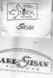
I have a client that ordered a large sign (46"H x 118"W - Double-Sided).
They were very specific with how they wanted their logo, even though we suggested adding larger lettering to fill up the space. This sign is on a busy highway and now that it's up, it's hard to see the "Stork" logo when you drive by, let alone the smaller "Organic Clothing..." underneath. Does anyone have any suggestions on what we can do, with minimal cost, to make this more visible? TIA!
stork.jpg


stork1.jpg
 

Texas_Signmaker

Very Active Signmaker
The stork image needs to be revisited. As it sits, it takes up too much room and forces all the text into an awkward size & position. Use the stork on the side and don't have it work into the word "Stork"..looks like "Tork".

Font needs to go entirely and should be bolder and cleaner looking. I'd rethink using light colored text on a light colored background (with only the shadow in dark)... Effectively you're only seeing that back shadow and it's just impossible to read.

I don't think there is anyway around a complete redo of that sign.
 

Billct2

Active Member
Perfect example of the client isn't always right. A photo mock-up of the sign as viewed from a car may have saved them the cost of a redo. This is a suggestion how to change the existing sign without a complete reprint. Add black vinyl lettering and a panel to cover that useless text
 

Attachments

  • 1a.jpg
    1a.jpg
    103.3 KB · Views: 324

Gino

Premium Subscriber
Judging by the way you two are holding it, it's not very heavy. I'd take it down and go back to the drawing table.... AFTER you hash it out with the customer that it will cost $XX amount of dollars to correct their mistake.

Heftier lettering, diminish the stork and much more contrasting colors will certainly help.
 

2B

Active Member
Are those graphics applied to raw wood?

we have run into this before.
as such we proof side by side, showing the customer requested and our suggestion for improved visibility.
 

unclebun

Active Member
Even if you are stuck with the logo as-is, the biggest readability problem you have is lack of contrast. White on parchment is never going to be readable, and the black outline doesn't really do much. It's the same problem I see when people use a printer for everything and letter vehicle windows (essentially black) with a red or blue logo, thinking that their white outline for cutting will give it contrast. It doesn't.

Make the background of the sign black with the white and light blue logo and see how much better it reads.

If you can talk them into altering the logo, make the bird smaller (primarily shorter), which will require changing the angle of the beak to keep the bundle (O) the right size. Then make the whole logo bigger so all the letters are bigger. You should be able to do that so that STORK goes full width of the sign, towards the top, while leaving the whole width of the bottom for the list of things they sell.
 

Texas_Signmaker

Very Active Signmaker
Don't be afraid to manipulate your customer's logo if it really doesn't work for a sign. (Ignore the kerning please)

8NExTmxsChYf92qeKmtJhhJ7cPBckvEPagQcfJx08w3uVb9qUvLTcPetnrr52rcY3JKIBAFVHWhrA4be64ALABur5RjmqFH2_c7gzPleNUgGvA1PAjA-g7vFuqCCSEh20qs7VT8qwQQ=w1410-h938-no
 
Last edited:

rossmosh

New Member
Signs are supposed to be informative. That sign says "Stork" and that's it because the rest isn't going to be easy to read.

So ask your customer very simply "Do you think people driving down the road know what "Stork" is?" If they're confident in their brand recognition that they don't think any other details are important, do what they want. If they're smart, they'll get the point and allow you to emphasize what Stork is.

As for the actual logo, I'm a believer in leaving people's logos alone as much as possible unless they suggest they'd like to talk about making changes. It might have taken them months to decide on that logo. They might have a bunch of branding and other crap that already exists. At the end of the day, they walked in for a sign. Just make the best of it by making the tweaks necessary to make it an effective sign.
 

jimbug72

New Member
Yeah, if you're stuck with that logo unchanged I think your only decent option would be something akin to what Billct2 posted. All the contrast info above is valid if you can change the logo or the substrate color, but if you have to use that specific logo on raw wood, you need to focus on making the descriptive info as legible as possible.
 

Johnny Best

Active Member
I like the Stork logo, you just need to readjust it to fit better. I am sure they have their label on everything and try to use logo for recognition. White back with dark letters would work better. Made a rough for layout as others have suggested.
 

Attachments

  • stork.jpg
    stork.jpg
    83.3 KB · Views: 227
Top