-
I want to thank all the members that have upgraded your accounts. I truly appreciate your support of the site monetarily. Supporting the site keeps this site up and running as a lot of work daily goes on behind the scenes. Click to Support Signs101 ...
You are using an out of date browser. It may not display this or other websites correctly.
You should upgrade or use an alternative browser.
You should upgrade or use an alternative browser.
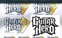
Does this look like infringement to you?
- Thread starter threeputt
- Start date

Ghost Prophet
New Member
Seems fine to me, logo is although similar, completely different as a whole. Sometimes adding stuff (like the squeegee) makes what would normally seem like infringement more acceptable. 
phototec
New Member
What are your thoughts? Does it cross the line?QUOTE]
I think the word "Hero" is exact, looks pretty much like they copied the "Guitar Hero" logo and changed the word Guitar to Grafix. I'm pretty sure 3M would NOT like their logotype used in this manner.
Attachments
showcase 66
New Member
lol....Grafix Hero...now comes with wireless squeegee!
 Thats funny.
cgsigns_jamie
New Member
If anyone would be upset I'd think it'd be 3M....
Jim Doggett
New Member
What are your thoughts? Does it cross the line?QUOTE]I think the word "Hero" is exact, looks pretty much like they copied the "Guitar Hero" logo and changed the word Guitar to Grafix. I'm pretty sure 3M would NOT like their logotype used in this manner.
Sure; it's clearly a take-off on the Guitar Hero brand. But type cannot copyrighted; all type is public domain. The Guitar Hero folks might be able to establish that they're infringed and that Graphics Hero creates substantial confusion with Guitar Hero. But I doubt it's worth much more than a quick cease and desist on their counsel's letterhead, which given the relative size of the companies, Summa would probably say "Oops, will do."
dj_elite
New Member
Funny you post this. This was up a couple of days ago and your logo looks pretty similar!
http://signs101.com/forums/showthread.php?threadid=73305
http://signs101.com/forums/showthread.php?threadid=73305
Locals Find!
New Member
Fonts are totally different. I don't think this would be something their attorney would even bother to waste time having an associate type the letter for. He would probably chuckle bill em for the hour and move on with his day.

Locals Find!
New Member
how are the fonts different?

Ok since you apparently haven't been looking at Fonts and artwork very long in your career let me point the most obvious one to you. The "A"s are totally different. Not to mention the jagged edges on font the OP image. Different fonts. Similar, but different.
SlightlyChilled
New Member
Left spike on the O that's about all.
dj_elite
New Member
Left spike on the O that's about all.
And the bottom of the H is wider. Hole in E is bigger. Tail on R is rounder not pointy. Hole in R is bigger. Hole in O is longer.
Looks very similar yet different.
AUTO-FX
New Member
Ok since you apparently haven't been looking at Fonts and artwork very long in your career let me point the most obvious one to you.
no need to be snippy with buttons, adtechia, he/she was just askin you to point it out. This after you said it's a "totally different" font, which it isnt ( totally different). It is in fact totally SIMILAR.
threeputt
New Member
Funny you post this. This was up a couple of days ago and your logo looks pretty similar!
http://signs101.com/forums/showthread.php?threadid=73305
I think you're really stretching on that one.
If your eye tells you my "s" looks like either the Specialized "s" or the Speed "s", I'd say it could use some training in font recognition and spacial perception.
As I stated in that same thread (with tongue tucked securely into cheek) we stole our logo from another company not Speed or Specialized.
Suggesting my logo looks like either of them is rediculous.You're really going nowhere in that canoe. IMHO
Locals Find!
New Member
no need to be snippy with buttons, adtechia, he/she was just askin you to point it out. This after you said it's a "totally different" font, which it isnt ( totally different). It is in fact totally SIMILAR.
Your right I was wrong. I APOLOGIZE buttons.
no need to be snippy with buttons, adtechia, he/she was just askin you to point it out. This after you said it's a "totally different" font, which it isnt ( totally different). It is in fact totally SIMILAR.
Your right I was wrong. I APOLOGIZE buttons.
It's ok. I didn't take any offense to it. I know I'm still learning which is why I read often and post less often.
Gino
Premium Subscriber
There’s no need for doing battle over this among you, but in my opinion, they are about 99% identical in font, color, effects, approach, shape, theme and just about anything else you say they are different.
For crying out loud… from a large ‘G’ to two smaller letters back up to large and then a total duplication of the word ‘Hero’. Sure a notch dropped here or there, but the similarities and sameness go beyond anything I’ve seen in a while. Get attorneys and courts involved ?? I doubt it. These two companies are probably scratching each others backs on this one. I’m sure someone got permission to resemble something so closely. Otherwise, they’d be taking a dumb stupid chance of copyright infringement, just like the title here states.
For crying out loud… from a large ‘G’ to two smaller letters back up to large and then a total duplication of the word ‘Hero’. Sure a notch dropped here or there, but the similarities and sameness go beyond anything I’ve seen in a while. Get attorneys and courts involved ?? I doubt it. These two companies are probably scratching each others backs on this one. I’m sure someone got permission to resemble something so closely. Otherwise, they’d be taking a dumb stupid chance of copyright infringement, just like the title here states.