-
I want to thank all the members that have upgraded your accounts. I truly appreciate your support of the site monetarily. Supporting the site keeps this site up and running as a lot of work daily goes on behind the scenes. Click to Support Signs101 ...
You are using an out of date browser. It may not display this or other websites correctly.
You should upgrade or use an alternative browser.
You should upgrade or use an alternative browser.
doesnt look right
- Thread starter Flubber
- Start date
Circleville Signs
New Member
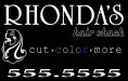
Your first instinct was correct.... Too many fonts, squishing the phone number, not enough breathing room around the "icon". Too much happening, and no balance.
i'd start from scratch.
i'd start from scratch.
SignManiac
New Member
signage
New Member
Geez.... stay in one place will ya.
 Now he has done something to make your avatar look right:ROFLMAO::ROFLMAO:
signmeup
New Member
You dare to mock the pancake King?!
Jillbeans
New Member
Some good suggestions.
I will reiterate:
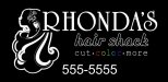
Space around the design is as important as the words.
If something in the design has eyes it should be looking into the design.
Don't stretch fonts to fit.
Don't make all your copy the same length.
Elements should be in close harmony with each other with no huge gaps between them.
Prioritize your copy-which is the most important, Rhonda's or Hair Shack?
The font you used for Rhonda's would read better in caps and lower case.
Try not to use "more" or "and more", it's too much of a catch all.
Everybody wants it though.
Love....Jill
I will reiterate:
Space around the design is as important as the words.
If something in the design has eyes it should be looking into the design.
Don't stretch fonts to fit.
Don't make all your copy the same length.
Elements should be in close harmony with each other with no huge gaps between them.
Prioritize your copy-which is the most important, Rhonda's or Hair Shack?
The font you used for Rhonda's would read better in caps and lower case.
Try not to use "more" or "and more", it's too much of a catch all.
Everybody wants it though.
Love....Jill
Marlene
New Member
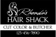
first and most important question is who are Rhonda's clients? is this a low budget salon, quick cut, cheap prices, no frills? higher end, not so cheap, a few little niceties like the offer of tea, coffee or spring water? high end, not cheap but worth it, nice looking place with a ton of extras? mostly young people? mostly old people?
I ask this as the look of a salon is important to people. there are those who just want it cheap and fast, no frills. there are young people who don't want people who only do little old blue haired ladies touching their heads. there are those who want the head massage, the warmed towel and some one who takes time with them and all that goes with that. people know what to expect from a salon by the sign or in this case the magnetic tells them not only verbally but visually. what I am getting from the design is Rhonda's salon is a low budget place, a little shabby and no frills. if this is what she does, then this look is good. if it isn't, you need to re-design this to reflect the business.
I ask this as the look of a salon is important to people. there are those who just want it cheap and fast, no frills. there are young people who don't want people who only do little old blue haired ladies touching their heads. there are those who want the head massage, the warmed towel and some one who takes time with them and all that goes with that. people know what to expect from a salon by the sign or in this case the magnetic tells them not only verbally but visually. what I am getting from the design is Rhonda's salon is a low budget place, a little shabby and no frills. if this is what she does, then this look is good. if it isn't, you need to re-design this to reflect the business.
Marlene
New Member
she works out of her home if that helps
and then...who does she want to come to her salon? will this draw in the people she wants? I'm asking as people forget the whole point of a sign of any kind is advertising and marketing to the people you want to do business with. I'm not trying to be a pain, just trying to help.
a new salon opened in a nearby town. the place is called "Salon Diva". it has a black sign with gold lettering and swirls, all hand done but not by a real sign painter, looks like self inflicted. the windows have cut out pictures of hair do's all over it, kind of like what you see a little kid do to decorate a bedroom wall.. there isn't a chance in hell that I would walk thru that door. the whole shop screams cheap, inexpericed, pink spikey hair, shaved half of a head, lots of nose rings looking stylist. what happens if this is a nice place? what happens if this is a great stylist with a ton of talent? the look doesn't support it. another example is a place I did go to. looked high end. I expected a great cut and frills. it took me months to grow out the mess they did and no frills, no pampering, nothing. their sign said great salon and it wasn't. we can make or break a business with a sign so knowing the who, what and why of the buisness you are designing for is important.
Flubber
New Member
well im not sure what type of clients she has or is hoping to get. but i do see your point im a rookie to this biz. I have only been doing this for 19 months and just started doing my own design for the last 5 months. I mainly just do installs and help design when he doesnt want to do it or doesnt have the time. But i am soaking up everything that you guys tell me........ so if i havent said it yet thanks for all your help.:U Rock::U Rock:
bob
It's better to have two hands than one glove.
Rethink your choices of type faces.
University Roman should never be used in all caps. In fact, it shouldn't be used at all except at gunpoint.
'hair shack' goes with nothing, neither in type face selection nor execution.
If you must use that wannabe decco image of the bint with the hair, at least flip it so it's facing in, not out. Make it larger to that it participates in the design, even impinges on the copy, instead of floating there like the chunk of clip art that it is.
Lose the color spectrum in the word 'color'. strictly amateur night. If you want to have a spot of color, put the spectrum in the highlights of the babe's hair.
Give that phone number mouth to mouth, you crushed the life out of it. Moreover, I despise using periods as phone number delimiters. It always looks like the work of a fourth rate typographer working at full capacity. Use dashes.
Don't line up everything like some exercise in mechanical drawing.
Other than that as well as the inherent unreadability of the thing, it's OK I guess.
