James Burke
Being a grandpa is more fun than working
I like the stroke, maybe a burgundy background, otherwise it's done.
I think that might fight with my floor display which is a weathered (distressed) gray cedar planking.
JB
I like the stroke, maybe a burgundy background, otherwise it's done.
No it does not pop its even harder to read I would do as suggested in post (7) a reversed panel maybe a dark grey panel
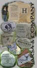
Usually when I see text along an edge, it follows a basic rule of the text reading clock-wise. I'm not sure that your layout would look better with the text flipped around frm where it is now, just a thought to consider.
No it does not pop its even harder to read I would do as suggested in post (7) a reversed panel maybe a dark grey panel
Usually when I see text along an edge, it follows a basic rule of the text reading clock-wise. I'm not sure that your layout would look better with the text flipped around frm where it is now, just a thought to consider.
") so I would tend to go with other posters here suggest and that is have your company name the predominant feature and horizontal ... trade show goer's heads are usually already "off to one side" after the first day!
so I would tend to go with other posters here suggest and that is have your company name the predominant feature and horizontal ... trade show goer's heads are usually already "off to one side" after the first day! 
Being left handed explains a lot (lefty here too).
What font is that you are using for your company name?
wayne k
guam usa
Should have rotated the type 180 and let it read on left side from bottom to top - then your eyes are at the top to scan the rest of the banner left to right and down to bottom. No biggie... at some point just get it done and take all the pointers for next time...