JgS
New Member
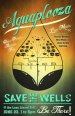
I don't claim to be a great designer but every now and then I give it a try. I am
hoping you all can help me clean up this design I started. This is for a poster
that will be hung up around town to promote an event. There are 2 variations of
the poster let me know which one you like and maybe some suggestion to clean up
the layout. The water drop logo was supplied by a different designer and needs
to stay on their unchanged. It needs to say: "Aguaplaooza",
"Save the Wells", and "Be There". Anything else can change.
A little info: This event is to raise money to fight a large company from out
of state that wants to dill a big well that will drain the water out of an
aquifer beneath a small town. The company intends to sell the water back to the
town among others like golf courses that use more water than they can pump out
of the ground.
Even though this is a protest, this event is just to raise money for legal fees.
Thanks.
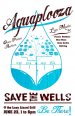