• I want to thank all the members that have upgraded your accounts. I truly appreciate your support of the site monetarily. Supporting the site keeps this site up and running as a lot of work daily goes on behind the scenes. Click to Support Signs101 ...

Hmmm...

qmr55

New Member
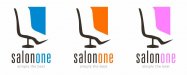
What do you think? It's for a client who runs a salon where all their customers are female. The first one is their requested colors. The color the owner was really persistent on was the washed out black, she LOVES that! I am thinking about giving them a few options with softer colors, the pink. I was given the opportunity to design open headed and do whatever I want with this. This was my first idea and I kinda liked it so I stuck with it....give me your opinions?

Thanks!
 

Attachments

  • salon_one.jpg
    salon_one.jpg
    22.9 KB · Views: 104

TwoNine

New Member
I like it - very clean and readable and I love the font! But what is the box thing? Didn't know if it had a 'meaning' or if it was all decoration. If it IS decoration, maybe make the contour of the box into a woman's figure sitting/laying on the chair? Too tacky? Just thinking with an all woman clientele - that would help to get that message across.

I admit - I'm a sucker for the "washed out" black too. In a 80-90%K sense of the term.

My 0.02!
-Chad

Oh, and I think the Orange is my favorite? They're all cool though.
 

qmr55

New Member
The negative space and the "other thing" were suppose to give the 3d look of a chair. Maybe it's not working how I see it? Hahah will work on a few other ideas for that I have. Thanks for the input so far guys!
 

SignManiac

New Member
Make the silhouette more of a woman's front brest-ez's so it looks like a figure sitting in the chair. That will relate better to a salon concept.
 

Jillbeans

New Member
Needs to look more chair-like and less foot-like.
I don't think most hairstyling type chairs have that big of a footrest.
I like the pink, is the shape supposed to be a mirror?
Love....Jill
 

Ken

New Member
I'm thinkin salonone i stretched vertical?..not liking that.
Can you do salon one on two lines?
Ken
 

bob

It's better to have two hands than one glove.
'Salomone' at first glance looks like you've misspelled 'Salmon' instead of 'Salon One'.

The whole chair/person symbolic thing isn't working. If you have to have the meaning of something explained to you, do something else.

Washed-out black just looks like a bad print job. Grunged black not so much. It looks trendy merely and therefore tacky.
 

SignosaurusRex

Active Member
Not feeling any "like" let alone "love" for any of it....but I'm no real designer either. The foot look really bothers me. That colored thing on the right makes me feel like some big obnoxious something or other will be in my face while I'm sitting in the foot chair getting closterphobia. Overall...lacks feminity...for an all female clientele.
 

Marlene

New Member
I am just so happy to see a hair salon that doesn't have the bored looking woman with the flowing hair used as their image that I love what you have. not crazy about the orange as it is too much of a trend color and will look dated fast. put the orange along the faded black (which looks gray) and you have a total trendy look. unless they are OK with looking trendy and changing when the colors go away, I'd use he one of the other two colors.
 
Personally, I had no problem identifying the salon chair although it could maybe use a little better referencing as it could be a bit less foot like and more chairlike. Matter of fact the concept could work well with more traditional salon icons such as a hair dryer, scissors or even a female head although those icons tend to be overused. I love the lettering style but I hate the uninventive tag line. Surely they can come up with something more original than that.

All in all I think it's a great idea for a logo, it just needs some tweaking.
 
Top