• I want to thank all the members that have upgraded your accounts. I truly appreciate your support of the site monetarily. Supporting the site keeps this site up and running as a lot of work daily goes on behind the scenes. Click to Support Signs101 ...

Logo for a tuning shop

J

john1

Guest
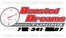
Here is another logo i did recently. This was intended for use on window advertising (window perf), banners and cut contour stickers

Custom specified it had to have a gauge (boost gauge) so i though that added to the logo nicely on the left to describe the type of work they do to the crowd they are targeting (tuner car scene)

Check it out, The customer loves it.

From the feedback i've been getting from customers lately, I think it's time to charge more for my logo work. I seen iSign is doing the same :thumb:
 

Attachments

  • proofs.jpg
    proofs.jpg
    102.5 KB · Views: 72

iSign

New Member
I realize it's done, but I thought of a very slight variation:
 

Attachments

  • boosted2.jpg
    boosted2.jpg
    54.7 KB · Views: 73

WildWestDesigns

Active Member
I always like to see a "redline" on the boost gauge and/or tachometer when it comes to this type of logo.

That's just me though as I've come from the diesel scene(have a DRW that puts down over 500HP at the rear wheels).

Just something about that ole redline that goes hand in hand with vehicle performance. I do like the logo though.

Altough, I have to ask, does the guy do just cars or trucks or both? 40 psi would destory most cars with a turbo or even a supercharger. Now on a diesel truck that's another matter. Sorry for the tangent.
 

Jillbeans

New Member
Take your finger off the italic button there boy.
Thicken up the white pinline on the name just a tad.
Even just lose the weird black bits in eam on bottom line.
It's kind of hard to read.
I don't care for the slanted dial, even if you are trying to indicate speed.
Try unslanting the tuning and that panel too.
I don't care for the heavy phone number, and don't usually include that in an actual logo.
Love.....Jill
 

Craig Sjoquist

New Member
Well you are doing better yes and very glad to see, this one is a great start also.

But you have a huge hole under the B ... I sign closed it up better with over lapping.
Contrast with your main words italics and phone italics one of should be normal, and yes phone is way heavy with heavy other copy... THINK CONTRAST thick/thin etc on everything.

Keep up the good work looks better each time.
 

signmeup

New Member
Not bad but isign showed you how it could to be tightened up. You could also do "dreams" all caps to fill in the hole. I like the slanty guage but agree it could use a redline and you could also slightly bend the needle. These little tweaks won't bother the customer at all and you'll have a better logo to show in your portfolio.
 
J

john1

Guest
Thanks guys, The customer does high horsepower cars. 600-1000hp hondas etc. Reason for this not having a redline is because most boost gauges don't. That's more of a RPM gauge in my opinion.
 

WildWestDesigns

Active Member
Thanks guys, The customer does high horsepower cars. 600-1000hp hondas etc. Reason for this not having a redline is because most boost gauges don't. That's more of a RPM gauge in my opinion.

And ECT, EOT, TFT, as well as EGT to name a few.

The stock boost gauge on my PSD has a redline between 35-40 PSI. I don't go by that, because the turbo I have on it now goes 50+ PSI. Stock boost gauges tend to have redlines on them, more so then a/m ones as a/m tend to also be concerned with aesthetics unless the person wants the redlines. Factory ones tend to worry about the general idiot vehicle owning population that may or may not know boost limits.

Also, you have to remember that redlines are symbolic of pushing limits. Which is what a tuning company is all about.
 

Marlene

New Member
I like it that when a customer sees the logo, he will know what the company does. I love how Doug added the white lines to the gray making it look like a road and tweaked out the letters. it's always fun to see what looks to be a good logo go one step further.
 

SignManiac

New Member
That really is good John. But if I read the OP correctly, the customer was happy with what had been done already and I assume it's a done deal. The reason I didn't offer up any suggestions of my own. To bad because yours is really good.
 

megacab

New Member
i like the OP's original, but with less slant, especially to the boost gauge. it tells an auto enhusiast exactly what the shop specializes in. or at least from my chair. but the slant of the gauge does not convey speed to me. just the over use of italics carried over to the gauge. The second John's is a nice take, but not the same meaning. he has what looks to be a tach in place of a boost gauge. Huge difference in the targeted market. IMHO, you absolutely have to have that boost gauge involved. it conveys everything. i also agree about the no red line. this is an obvious aftermarket parts shop. i have not seen all boost gauges out there, but i've seen a few. i have yet to see an aftermarket boost gauge with a red line and would have picked that out as an obvious faux pas had one been included.
 
J

john1

Guest
Thanks again guys, I'm happy that i'm progressing in logo design so well :)
 

WildWestDesigns

Active Member
i have yet to see an aftermarket boost gauge with a red line and would have picked that out as an obvious faux pas had one been included.

Boost gauge with redline:

picture.php


Now that is somewhat of a combo digital-"analog" gauge, but that's the way it's going nowadays. BullyDog is now strictly monitors and it's hard to get an analog gauge from them.

You are right, it is few and far between. My stock gauge has a redline, my a/m one does not.

Of course, then you have the whole boost/vacuum gauge versus just boost gauge.
 
Top