-
I want to thank all the members that have upgraded your accounts. I truly appreciate your support of the site monetarily. Supporting the site keeps this site up and running as a lot of work daily goes on behind the scenes. Click to Support Signs101 ...
You are using an out of date browser. It may not display this or other websites correctly.
You should upgrade or use an alternative browser.
You should upgrade or use an alternative browser.
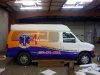
New wrap I finished last night...
- Thread starter Circleville Signs
- Start date
Circleville Signs
New Member
Phone number isnt' following the bodyline because the client insisted that it be parallel to the ground. Same with their logo. No amount of talking them out of it worked.
Gotta love clients.
Gotta love clients.
letterman7
New Member
Parallel is a relative term. Always line it up with a body line - it's the first thing your eyes will find. I'd be willing to bet if you did that, they wouldn't have batted an eye. But overall, I might have brought the orange into the topper just to blend it in a little.
kustomsigns&designs
New Member
That number doesn't look parallel to the ground either!?
Pat Whatley
New Member
Phone number isnt' following the bodyline because the client insisted that it be parallel to the ground. Same with their logo. No amount of talking them out of it worked.
Gotta love clients.
Meaning that when the gas tank is full it will be at one angle and when it's empty it will be at another because of the weight difference.
With that design they'd have come out much better, and cheaper, just doing the logo and lettering in cut vinyl and forgetting the background.
Diddo on the topper, curved text and phone.
Just print a piece for the topper that fades up from the yellow into white. Since you should reprint that curved text anyway.
We would patch in a piece (only background fade) that covers the curvy text with seams at the door and body line. Then slap regular decal lettering. Or print a patch with proper text placement.
Phone ugh....crooked.
Been there.....always go with your gut when leveling a graphic.
Circleville Signs
New Member
How would you handle the topper? It's done in gel-coat, so nothign will stick to it for longer than a couple of weeks?
Gary
Gary
Pat Whatley
New Member
whoops
PMG
New Member
how would u handle a boat......boats are gel coated and they are wrapped everyday!!!!!!How would you handle the topper? It's done in gel-coat, so nothign will stick to it for longer than a couple of weeks?
Gary
Circleville Signs
New Member
Don't do boats - at least we haven't.
In any event, I have to say - this is the first time I've taken a beating on here. Feel like I'm earning my keep") LOL.
LOL.
Gary
In any event, I have to say - this is the first time I've taken a beating on here. Feel like I'm earning my keep
LOL.Gary
Don't do boats - at least we haven't.
In any event, I have to say - this is the first time I've taken a beating on here. Feel like I'm earning my keep
Gary
lol thats why I havent posted any wraps yet. scared of getting flogged