• I want to thank all the members that have upgraded your accounts. I truly appreciate your support of the site monetarily. Supporting the site keeps this site up and running as a lot of work daily goes on behind the scenes. Click to Support Signs101 ...

One More Retro-themed Design

Dan Antonelli

New Member
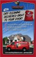
This was done a bit ago, but I finally had a chance to visit client the client in Rhode Island and take some pics of actual trucks. He's starting a home delivery portion of the business. He has a fleet of trucks, all painted Ferrari red, including some larger old-style panel delivery trucks. Huge exposure, and has been great for the client's business.

You can see how we used the truck in his print ads/in-store signage.
 

Attachments

  • courtesy.jpg
    courtesy.jpg
    63.3 KB · Views: 102
  • Unknown.jpg
    Unknown.jpg
    80.1 KB · Views: 51

signgal

New Member
Yeah, and the "trippy" blurred background gives you a nice tingle in the middle of the day too rofl
 

Jillbeans

New Member
I like this one even more than the other one from today.
I will look at this every time I see the Lowen ad <<< as sort of a virtual eye cleanser.
Love....Jill
 

Craig Sjoquist

New Member
This one is awesome also with a great way of making retro look up to date

On this one I don't like placement of phone number..to close to bottom.. thinks it should be under website...lol of course lighter weight area code and no www. like I mentioned on last one ... gots to say it lol
 

Marlene

New Member
Dan, that is such a great looking van! It is nice to see a wrap that doesn't have tribal stuff, diamond plate, skulls or flames. wraps don't have to be that and your wrap really show cases what wraps can be.
 

signmeup

New Member
Looks great! Kinda freaky with the wheels and background blurred and no driver though. How come when I make the first and last letters big I get grief for it? :rolleyes:
 

TheSellOut

New Member
Very nice layout! Your work is always top notch and thanks for sharing! If I were to nit-pick then I think you should 86 the blurred sold sign in the bottom right and adjust the tracking to give a little more space between the letters for the website and phone #

SignMe...I thought your layout looked great with the 1st and last letters bigger! wasn't that "Appletown" or something?
 

cptcorn

adad
What's great about this work is not that it is "retro" themed. What really stands out about this work is the artwork redefines the shape of the "substrate" in a sense. Simple clean artwork redefined that tall harsh square shaped flyer into an elegant looking shape that feels soft and inviting.
 

Dan Antonelli

New Member
Very nice layout! Your work is always top notch and thanks for sharing! If I were to nit-pick then I think you should 86 the blurred sold sign in the bottom right and adjust the tracking to give a little more space between the letters for the website and phone #

SignMe...I thought your layout looked great with the 1st and last letters bigger! wasn't that "Appletown" or something?

Yeh, the sign is coming out on final - this is still comped (we have to photograph the laundry bag hi res, etc).

Regarding the kerning, they don't call me Kern Boy around here for nothing! I kern everything REAL TIGHT! :)
 

TheSellOut

New Member
LOL...in that case what's up with that "Cleaners" KernBoy...jk...great work and I love the shape of the border!!
 
Top