-
I want to thank all the members that have upgraded your accounts. I truly appreciate your support of the site monetarily. Supporting the site keeps this site up and running as a lot of work daily goes on behind the scenes. Click to Support Signs101 ...
You are using an out of date browser. It may not display this or other websites correctly.
You should upgrade or use an alternative browser.
You should upgrade or use an alternative browser.
Pantone Plus Color Chart
- Thread starter Tovis
- Start date
idsignsil
New Member
bob
It's better to have two hands than one glove.
Anybody know where I can download a PDF or EPS color chart with all of the current pantones on it to print for reference.
You don't want a PDF or EPS color chart. There are color shifts with these two formats, subtle with PDF, hideous with EPS, that will confound you. You want a native color chart. That would be a chart created and printed with whatever software you're using.
If you're using Flexi, it's a relatively simple thing to create but it's huge. You can perform some really clever editing, mainly of the color names, and get it down to somewhere around 2'x3'. I did and have a very satisfactory chart I can print on any media.
I'm sure it's doable in other packages as well. Just how you do it depends on the package.
Mike F
New Member
You don't want a PDF or EPS color chart. There are color shifts with these two formats, subtle with PDF, hideous with EPS, that will confound you.
Out of curiosity, why does this occur? Isn't the point of Pantone colors to be able to hit a specific color without worrying about other factors? I guess what I'm asking is, if your printer or RIP is equipped to handle Pantones, why would the format of the file affect the output color? Shouldn't the RIP or printer see "Pantone C278" or whatever and recognize that, "hey, that's the color I need to hit for that, let's pull the values from the Pantone library and get to work"? Obviously the type of media you print on and the profile you use can cause a shift, but how do different file formats cause a shift before it even essentially hits the media? Aren't Pantones supposed to be an "it is what it says it is" type deal? Sorry if these are stupid questions, color management is really not my strong suit.
Tovis
New Member
I'm using Onyx, I have used flexi at a previous job though. Generally we print .eps for vectors, I think pdf files can do strange things with drop shadows and transparencies.
From what I understand the RIP recognizes Pantone colors and processes them as LAB and bypasses or sets them to a different rendering intent.
What do you print with Bob?
From what I understand the RIP recognizes Pantone colors and processes them as LAB and bypasses or sets them to a different rendering intent.
What do you print with Bob?
Banners Signs Etc.
New Member
I'm in color management madness with the addition of our gandi 1224 and onyx...whereas before it was just versaworks and rs-640 with built in swatches...
Printed out a pantone chart from onyx...never matched up to files out of illustrator...Hell the actual pantone swatch book was more accurate out of illy to the flatbed.
We are contemplating trying to rent a color calibration tool or someone who knows what they are doing to figure this out...
any recommendations or settings to change?
bob
It's better to have two hands than one glove.
Out of curiosity, why does this occur? Isn't the point of Pantone colors to be able to hit a specific color without worrying about other factors? I guess what I'm asking is, if your printer or RIP is equipped to handle Pantones, why would the format of the file affect the output color? Shouldn't the RIP or printer see "Pantone C278" or whatever and recognize that, "hey, that's the color I need to hit for that, let's pull the values from the Pantone library and get to work"? Obviously the type of media you print on and the profile you use can cause a shift, but how do different file formats cause a shift before it even essentially hits the media? Aren't Pantones supposed to be an "it is what it says it is" type deal? Sorry if these are stupid questions, color management is really not my strong suit.
I have on my wall a Pantone color chart created and printed in Flexi. Along side that chart is another created by saving that same chart as a PDF and then printing it. The differences in color are many and obvious.
I haven't spent a lot of time contemplating why this should be the case. Regardless of why, it exists. I merely deal with it based on the fundamental principle that what comes out of the printer is the truth.
scuba_steve2699
New Member
I have on my wall a Pantone color chart created and printed in Flexi. Along side that chart is another created by saving that same chart as a PDF and then printing it. The differences in color are many and obvious.
I haven't spent a lot of time contemplating why this should be the case. Regardless of why, it exists. I merely deal with it based on the fundamental principle that what comes out of the printer is the truth.
Ever think that it may be in the PDF output settings you used? In most software it defaults to output the colors in CMYK - if your RIP cannot identify the Pantone colors, then it cannot maintain them. Roland has recently added this and I believe most RIPs already have it. If you export to PDF and have color settings at convert to CMYK or RGB, then the spot color will shift. If you are running from Flexi and print directly from there, it will maintain the color without a shift.
just my 2 cents.
Haakon
New Member
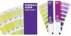
How many of you have a actual Pantone Formula Guide though? The ones issued by Pantone themselves. These are off course 100% true in colour, and should be used to verify that your printer actually prints the correct colours.
They also have cmyk conversion digits for each pms colour. Not cheap, but a pretty important tool when it comes to colour management.
They also have cmyk conversion digits for each pms colour. Not cheap, but a pretty important tool when it comes to colour management.
Attachments
SightLine
║▌║█║▌│║▌║▌█
Um. If the spot colors are all correctly specified as they should be, in other words all colors are Pantones embedded in the pdf then there should be no color shift as long as your RIP recognizes Pantone spot colors.
When we open a pdf, ai, or eps that has vectors with Pantone spot colors assigned FlexiSign recognizes them correctly and prints them as it should.
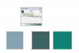
I also just tested for the heck of it to be sure. Interstingly Flexi even honors and recognizes the new Plus colors that are not even part of Flexi's library. Attached.... the middle color is a new color from the Plus library.
I have the older libraries in a nice PDF format. I need to do the same and make a new one with the Plus libraries.
Also if you want to add the new Plus libraires to your older Adobe apps....
http://www.creativepro.com/article/add-pantone-plus-library-adobe-apps-free
Links to download the installers directly from Pantone on that page.
When we open a pdf, ai, or eps that has vectors with Pantone spot colors assigned FlexiSign recognizes them correctly and prints them as it should.
I also just tested for the heck of it to be sure. Interstingly Flexi even honors and recognizes the new Plus colors that are not even part of Flexi's library. Attached.... the middle color is a new color from the Plus library.
I have the older libraries in a nice PDF format. I need to do the same and make a new one with the Plus libraries.
Also if you want to add the new Plus libraires to your older Adobe apps....
http://www.creativepro.com/article/add-pantone-plus-library-adobe-apps-free
Links to download the installers directly from Pantone on that page.
You don't want a PDF or EPS color chart. There are color shifts with these two formats, subtle with PDF, hideous with EPS, that will confound you. You want a native color chart. That would be a chart created and printed with whatever software you're using.
If you're using Flexi, it's a relatively simple thing to create but it's huge. You can perform some really clever editing, mainly of the color names, and get it down to somewhere around 2'x3'. I did and have a very satisfactory chart I can print on any media.
I'm sure it's doable in other packages as well. Just how you do it depends on the package.
Attachments
idsignsil
New Member
The file that I made, that is linked above, was done in AI CS3 like I said. It was done on the computer that I print from. I printed from AI right into Versaworks. The colors look very close to the Pantone swatch book that I have. It works for us, but maybe not for others using a different rip. Only way to find out is to print it and compare to the Pantone swatches.