• I want to thank all the members that have upgraded your accounts. I truly appreciate your support of the site monetarily. Supporting the site keeps this site up and running as a lot of work daily goes on behind the scenes. Click to Support Signs101 ...

Quality and reds?

customcreations

New Member
I have problems printing read on y machine. If I have to print something with red in it I have to flip my profile up to quality 5. Thing is it lays down tons of ink,over saturated darker colors. I don't like it really but have no choice it seems. Has anyone else had this problem. We even had the machine profiled and it came out even worse. I need more info on the quality settings that pertain to the ink saturation levels. The quality settings seem to effect the saturation and ink flow. I have looked at the chart on the Mutoh site and it means nothing to me. I need plan English as to how the settings effect each other. Thanks --Phillip
 
P

ProWraps™

Guest
my mutoh prints reds fine. wait till your hair turns grey, from trying to print grey... ugh. what profiles are you using?
 

javila

New Member
The best way to get reds, if to make your files correct.

If you're working in photosop and inside of RGB color mode: when you pick a red use the cmyk inputs and choose 100 m 100 y. This'll be based from SWOP 2, but it's a good start. Likewise if you're working in Illy, or Corel, stick to M Y at 100 percent and keep it under the cmyk color space.


You'll get better reds if you set up your working spaces to match the profiles from the RIP though.
 

randya

New Member
I have problems printing read on y machine. If I have to print something with red in it I have to flip my profile up to quality 5. Thing is it lays down tons of ink,over saturated darker colors. I don't like it really but have no choice it seems. Has anyone else had this problem. We even had the machine profiled and it came out even worse. I need more info on the quality settings that pertain to the ink saturation levels. The quality settings seem to effect the saturation and ink flow. I have looked at the chart on the Mutoh site and it means nothing to me. I need plan English as to how the settings effect each other. Thanks --Phillip

Just changing your 'Mode" to Quality 5 makes your profile invalid.

You must use the 'Mode' that the profile was designed for to make ink limits and color correction valid and controllable.
Quality 5 uses a larger drop size set than Quality 4, even though both are 720 x 720 8 pass, which is why you are seeing more ink.

Changing the 'Mode' often time completely invalidates a profile.
Changing any of the parameters with alter the 'profile' usually with inconsistant and uncontrollable results.
The diffusion, ink restrictions, ink limits and icc color correction are ALL part of a profile that controls how much ink is placed on the media and what colors those amounts and proportions of inks produce.

Profiling outdoor media is still a bit of an artform.
And color management is critical to being able to control your output.
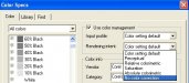
That means that the color space that the artwork is created in must be defined and controlled so that the RIP can properly interpret that color space and best match it to the profile.

One of the easiest ways to do this is to save the file as a .tif with an embedded profile.
 

mrugen

New Member
If you want PURE RED, double click on the red in the swatch table. Now change the color management rendering intent to SPOT and save. Rockin red....
 

Compilla

New Member
If you want PURE RED, double click on the red in the swatch table. Now change the color management rendering intent to SPOT and save. Rockin red....

Welcome Mark!!

What if using Flexi 8.5 ? Spot Color it is not an option on the rendering intents....
 

mrugen

New Member
Reds

Sure it is IF you double click on the swatch table color. Double click on the red in the swatch table, then look to the right whre you'll see color management, change the rendering intent to spot.

It is NOT part of the output system anymore for some reason.
 

Compilla

New Member
Sure it is IF you double click on the swatch table color. Double click on the red in the swatch table, then look to the right whre you'll see color management, change the rendering intent to spot.

It is NOT part of the output system anymore for some reason.

Not in there Mark...
 

D&Tgraphics

New Member
Try using a pantone color pallete. Pick a bunch of reds and make little squares in a file and fill them with different reds. Now print them and see which one looks best. Use that as your default red.
 

Valentino

New Member
Pantone 1797 PC

C: 0
M: 100
Y: 99
K: 4

as proof...the swatch book was printed on our VJ 1204, at graphics 2 on 3951 matte. It's a really rich blood red. pantone 711 is good too. (4th row down, middle column)
 

Attachments

  • 104_0519.JPG
    104_0519.JPG
    61.9 KB · Views: 122
Top