-
I want to thank all the members that have upgraded your accounts. I truly appreciate your support of the site monetarily. Supporting the site keeps this site up and running as a lot of work daily goes on behind the scenes. Click to Support Signs101 ...
You are using an out of date browser. It may not display this or other websites correctly.
You should upgrade or use an alternative browser.
You should upgrade or use an alternative browser.
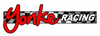
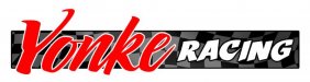
race shop logo
- Thread starter modernmav
- Start date
SignManiac
New Member
Does that read Yonke or Gonke? If I have to ask, you might want to reconsider your font choice. Oh and the checkered flag under the name is a bit to much against the red and black.
SignManiac
New Member
SignManiac
New Member
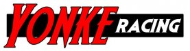
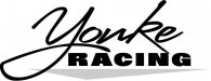
I like that one SignManiac, what font is that? here was my next attempt for the same one but i'll try back to black in white
It's a Letterhead Font. Go have a look at it. I could tell you the name but you would be better off finding it there yourself and discovering all of the many good fonts that are out there. You'll learn more that way than if someone else does it for you.
Good fonts are an investment, not an expense. Why use the same MS publisher fonts that everyone else uses? Strive to be different.