Haakon
New Member
Just wanted to swing this design-in-progress by you for some feedback maybe?
This is a redesign of a logo for a local motorsport club that have a 50/50 split between motocross and circuit car racing, so the design brief was to include a reference to both groups if a symbol were a part of the logo.
They are also in the process of building a whole new raceway (logo already made by someone else) and they wanted the club to have a proper logo as well. You can see the current one in the same pic as the track project logo.
I wanted to make a simple logo that would work well in a single colour, as well as multicoloured if they choose to go that route. Tried at first to make something that possibly linked to the track logo, but they came out very generic I think (the ones at the bottom. A pure typographical logo was also kind of boring.
So I made a logo with a symbol that incorporates faint design elements of both motocross bikes and race cars. Should be easy to understand for those interested in motorsports, and for the rest it's pretty hard to miss what its about when "motorsport club" is part of the name. Norwegian spelling off course")
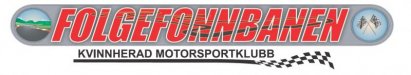
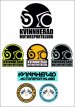
This is a redesign of a logo for a local motorsport club that have a 50/50 split between motocross and circuit car racing, so the design brief was to include a reference to both groups if a symbol were a part of the logo.
They are also in the process of building a whole new raceway (logo already made by someone else) and they wanted the club to have a proper logo as well. You can see the current one in the same pic as the track project logo.
I wanted to make a simple logo that would work well in a single colour, as well as multicoloured if they choose to go that route. Tried at first to make something that possibly linked to the track logo, but they came out very generic I think (the ones at the bottom. A pure typographical logo was also kind of boring.
So I made a logo with a symbol that incorporates faint design elements of both motocross bikes and race cars. Should be easy to understand for those interested in motorsports, and for the rest it's pretty hard to miss what its about when "motorsport club" is part of the name. Norwegian spelling off course