-
I want to thank all the members that have upgraded your accounts. I truly appreciate your support of the site monetarily. Supporting the site keeps this site up and running as a lot of work daily goes on behind the scenes. Click to Support Signs101 ...
You are using an out of date browser. It may not display this or other websites correctly.
You should upgrade or use an alternative browser.
You should upgrade or use an alternative browser.
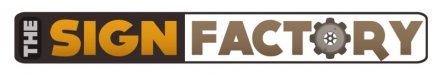
Shop logo re-design
- Thread starter jtinker
- Start date

TyrantDesigner
Art! Hot and fresh.
I like the idea of the spinning gear, i would probably try to limit your colors down a little just to make it cleaner on the eyes (not counting the gear you have 6 colors) ... layout is pretty standard, and a lot better than before. probably make "The" with the background the same color and styling as 'factory' that is all I can think of.
Craig Sjoquist
New Member
Agrees reduce colors, the same as fact_ry..outside of gear same as sign.. inside maybe even same as fact_ry
Another would be use a light or med weight font for the
I like the simple, bold, clean look of this, with the clean gear placed, also the air space in panel.
Another would be use a light or med weight font for the
I like the simple, bold, clean look of this, with the clean gear placed, also the air space in panel.
jtinker
Owner
weaselboogie
New Member
Still could use some work, but it's infinitely better than your first logo.
SignProPlus-Chip
New Member
Definitely simplify the gear design. Also watch the kerning on the font you're using, seems to be a lot of space between the "R" and the "Y". Speaking of the font, what's with the extended leg on the "R"? It's creating a horrible tangent and point of tension on the whole design IMO.
Last edited: