• I want to thank all the members that have upgraded your accounts. I truly appreciate your support of the site monetarily. Supporting the site keeps this site up and running as a lot of work daily goes on behind the scenes. Click to Support Signs101 ...

Signs around the resort

Hayward Mike

New Member
I introduced myself a few weeks ago as the owner of the Hayward School of Dimensional Sign Making and have finally become a merchant member. I thought it was time to post some of my work and open myself up to criticism and or compliments. I've been in this business for nearly 30 years so I should be able to handle either or by now.

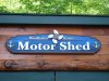
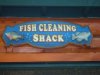
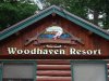
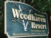
Here are some pictures of signs from around the resort where our workshops are held.
Let me have it!
 

Attachments

  • DSC00052.jpg
    DSC00052.jpg
    81.7 KB · Views: 99
  • DSC00057.jpg
    DSC00057.jpg
    54.8 KB · Views: 94
  • DSC00065.jpg
    DSC00065.jpg
    84.1 KB · Views: 110
  • DSC00068.jpg
    DSC00068.jpg
    97.3 KB · Views: 90

GAC05

Quit buggin' me
They all look well done.
Maybe the colors are a little muted but it fits the application with the stained wood in the backgrounds.
Nice detail in the fish.

wayne k
guam usa
 

SignManiac

New Member
Nice style and finishing. The only thing my eye picks up immediately are kerning issues along with a little crowding to the borders of your sign. The only other last detail is on the Woodhaven resort sign, I would have matched the angle of the peaked roof with your lashed wood frame surrounding the fish. For some reason my eye notices the two different angles right away.

But all in all, really nice work and it shows you've been making signs a really long time:thumb: Hope you take the critique in a positive way as it is meant to help out.
 

Billct2

Active Member
Great stuff...but since you asked... the one that I noticed right away is the sandblasted Woodlands sign, needs more room at the bottom, amd I would have capitalized Cabins, just looks odd to be the only lower case letter at the beginning of a word.
But really nice dimensional work.
 

JR's

New Member
What a rookie mistake. First thing I noticed and it bug me right off.
On the bluegill, sunfish. The pectoral fin has six spines it's supposed to be eight.
Wink wink. Just kidding.
Beautiful work thanks for sharing.:Big Laugh
 

Marlene

New Member
the workmanship is really nice. love the birch tree. there are a couple of really minor things others brought up but besides that, these are some great signs.
 

Hayward Mike

New Member
wonderful criticism

Thank you for the great observations, I believe I agree with all of them - let me explain.

The angle of the log border was supposed to match the gable but when I took my measurements I remember there was at least 9' snow banks in front of the lodge so it was hard to get an accurate measurement - It drives me nuts too!

The colors that I use around the resort are a bit muted but, I think it works in this case because of the rustic surroundings. I also took these pictures on an intensely sunny day and noticed that the signs in the photos appear a bit more washed out than they really are.

Ok, I'll stop now, enough excuses.


Mike
 

Marlene

New Member
the colors are perfect for these signs! you wouldn't want bright colors as it wouldn't fit. the lower case "c" in cabins is a whole other story ;)
 
Top