-
I want to thank all the members that have upgraded your accounts. I truly appreciate your support of the site monetarily. Supporting the site keeps this site up and running as a lot of work daily goes on behind the scenes. Click to Support Signs101 ...
You are using an out of date browser. It may not display this or other websites correctly.
You should upgrade or use an alternative browser.
You should upgrade or use an alternative browser.
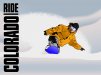
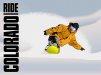
Snowboarding project
- Thread starter Pixels Are Bad Mmmkay?
- Start date
iSign
New Member
it's awesome!!!
grabbing my snowboard & getting on a plane for Whistler in 6 days... can't frikkin wait!!!
I wouldn't ever critique art that is better than I can draw... but I will say if you do find yourself messin' with it a bit more anyway, I'd wonder if you think some airborn flakes of "spray" might look nice slightly in front of the rider too... like what might be thrown up more off the nose of the board.. just to add depth...
Jillbeans
New Member
The yellow board clashes with the orangey-colored coat, make the board and the guy's goggle frames the same color, like some sort of blue. Not too blue or it will grey out the background.
But think of the color wheel and orange being the opposite of blue (or at least that's what I remember from high school art class) I may mean complimentary. It's been over 30 years now.
Love....Jill
But think of the color wheel and orange being the opposite of blue (or at least that's what I remember from high school art class) I may mean complimentary. It's been over 30 years now.
Love....Jill
Craig Sjoquist
New Member
I like it ... Surely tweaking will make it better but for the most part wow awesome.
I wouldn't know where to begin with PC art
I wouldn't know where to begin with PC art
Pixels Are Bad Mmmkay?
New Member
it's awesome!!!
grabbing my snowboard & getting on a plane for Whistler in 6 days... can't frikkin wait!!!
I wouldn't ever critique art that is better than I can draw... but I will say if you do find yourself messin' with it a bit more anyway, I'd wonder if you think some airborn flakes of "spray" might look nice slightly in front of the rider too... like what might be thrown up more off the nose of the board.. just to add depth...
Oh, man! I'm so envious. Especially since this year was a total bummer for me living in Illinois and starting a new business. I had to limit my snowboarding to one day in Wisconsin this year. But I guess since I didn't have the budget to go riding it couldn't have happened at a better time. This season was terrible, especially for the Midwest. I love Colorado and I've gone riding there at several different locations. The people and the vibe out there are both great. I've also been to Upstate Michigan and several places in Wisconsin but I've never ventured into Canada. I'd love to someday so I'll guess I'll be makin' as many signs as I can in the meantime.
")
Pixels Are Bad Mmmkay?
New Member
Looks good,
The only thing that stands out a little is that the drawing lacks depth. The figure looks pasted in front of the background and not really part of it.
Need some shadows or more detail in the snow to get the figure a little more 3d.
wayne k
guam usa
The hard lines on the rider definitely do make it pop and make the rest of it look flat but I kinda want it subdued at least to some point. It definitely can use more depth. The blurred edges on the hills give it a cheap sense of depth but I really need to do more with the contour of the hills and variations of light and dark throughout. I'm kind of at a stopping point at the moment because I'm not entirely sure I even like the background. I rushed it if anything. I just haven't thought of any ideas I'm happy with yet. The original photo had some trees I didn't like because of the perspective and the distance of them. Who knows how it will finally look when I finish tweaking it but I do plan on working with it a little more once I've got some ideas from you guys.
Pixels Are Bad Mmmkay?
New Member
The yellow board clashes with the orangey-colored coat, make the board and the guy's goggle frames the same color, like some sort of blue. Not too blue or it will grey out the background.
But think of the color wheel and orange being the opposite of blue (or at least that's what I remember from high school art class) I may mean complimentary. It's been over 30 years now.
Love....Jill
Yep, blue compliments orange and vice versa. I might try changing the board color around. I hadn't really thought about it much. Most of the newer boards are so edgy, bright neon colors are popular on bases. I'm not so sure I want more blue in it though. I could just make the board and goggles black and sort of neutral, but I like mixing the colors up as Colorado is a colorful place and hardly anybody out there wears clothing that matches. Hahaha!