-
I want to thank all the members that have upgraded your accounts. I truly appreciate your support of the site monetarily. Supporting the site keeps this site up and running as a lot of work daily goes on behind the scenes. Click to Support Signs101 ...
You are using an out of date browser. It may not display this or other websites correctly.
You should upgrade or use an alternative browser.
You should upgrade or use an alternative browser.
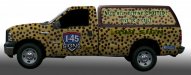
Spot on wrap
- Thread starter signs2trade
- Start date
Rustyrussell
https://www.austinsignco.com/
Looks good , a little too busy for my taste...but i guess thats the idea?
signs2trade
New Member
Agree....busy......this sits on the corner most of the time....just want people to look....for a sign company i have a crappy sign....landlord offers nothing....
grafixemporium
New Member
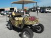
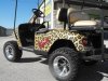
Hey Keith, check out this golf cart we did recently. Turned out pretty cool for a leopard print golf cart with pink stuff on it. The pattern was made with AlienSkin filters. Looks very realistic!
Attachments

signs2trade
New Member
i like it.....maybe i should put some pink on mine.......
R08
New Member
I didn't notice your number was even on the truck, then when I saw it, I looked harder and saw your area code. You have an outer glow on the copy above, maybe you should do the same on the number?
Ya.. I didn't SPOT that either. :ROFLMAO:
johnnysigns
New Member
OP, you're missing the mark big time w/ legibility at a distance w/ that first concept. That background art is swallowing your content.

artsnletters
New Member
maybe it's me, but those "spots", look like random spray bomb dots. I think you're making a really fugly design just to wrap it around an apparently catchy tag line. Not trying to be mean, i just think that design will get the exact opposite response for marketing yourself. Shouldn't YOUR design be the absolute best-top shelf work, demonstrating your design and print abilities?
Is it trying to be animal print like the cool golf carts below it?
Again, JMO.
Tim
Is it trying to be animal print like the cool golf carts below it?
Again, JMO.
Tim
wrapman jamz
New Member
Good concept....but the background is way to much
")
Jillbeans
New Member
I am sorry, but that just looks terrible.
It clashes with the colors in your logo and is virtually illegible from a distance.
The text lacks contrast and the stretched phone number is nasty looking.
Perhaps if you changed all the text to plain white it would look less awful.
Or even if you made the background whiter and the spots blacker.
From the thumbnail I thought it was camo.
Your logo is fine, I would build off of it.
Love....Jill
weaselboogie
New Member
I'm with Jill. Just looking at the thumbnail, it looks cluttery. I'd drop the whole animal fur concept and just go with a clean design.
Dan Antonelli
New Member
Build your brand first, then your messaging. Both are lost here--