• I want to thank all the members that have upgraded your accounts. I truly appreciate your support of the site monetarily. Supporting the site keeps this site up and running as a lot of work daily goes on behind the scenes. Click to Support Signs101 ...

strange colour request

gabagoo

New Member
I am not sure if this person is confused or maybe I just have never heard of a colour being described this way.

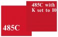
The request is for a pantone 485 with 10%K - That cant be correct. Would not the red get terribly dark? I also have never heard of mixing a pantone with one 4 colour process colour. I think it must be a reference to a possible shadow below the copy or something.
Anyone heard anything like this before?
 

Rydaddy

New Member
That actually just made me sick to my stomach. Getting asked to produce that type of "color" is usually a red flag for me. Double ditto what Gino said... have them give you something in your hands that came out of their hands so you know what they are expecting.
 

Rooster

New Member
They've spec'd the color and then they added 10% black to get what they want. It's not impossible to achieve a good match to what they're after if you know enough to ask them the right questions and apply the additional K tint correctly.

I'm just going to assume they're using an Adobe CS product. You'll need to know their color settings for all their input and output profiles on the job so you can ensure you're adjustments are done to the same settings. It should be as easy as opening the file and hitting print if you have a color managed workflow and your settings are the same as theirs.
 

Gino

Premium Subscriber
Yeah, mixing up colors is about as safe as messin' around with your neighbor's new Mercedes.... that he didn't buy yet.

What your client sees on his screen is probably different from your screen and then he wants you to add 10% of anything...... ??

Give me a break, that's a recipe for total disaster. He can only picture this color in his head. He can’t produce it and then he wants you to experiment for a final conclusion. Right.

We just had a woman in her yesterday. She wants goldie yellow with some taupe in it lettering on her black awning. She’s an interior decorator and has this kind of mentality ?? Artsy-fartsy people are a laugh…….. and a nightmare all wrapped up into one. My girl is bringing a sample tomorrow [oops today] for us to prepare from.

This perfect world of color only exists if everyone had the exact same software, monitors, printers, eye/brain color wheel coordination and all worked in the same room at the same time.
 

R08

New Member
:goodpost: +1 for what Gino said.

And don't you just love it when a customer comes in and says he needs lettering in a hummingird blue or a autumn red (names of colors that a manufaturer gives their own products)
 

boxerbay

New Member
create the file in AI.

open your pantone swatch book window>swatch libraries>color books>pantone solid coated

drop in your pantone 485 then click the CMYK sliders box next to color. then just add the 10% K. You should end up with C0 M95 Y100 K10. The added 10K makes the red a bit deeper richer and not so bright.

He probably went thru this process with someone else and that is how they found the color he likes.

I would recommend running a color proof on the media and requiring he sign off before running the job.
 

boxerbay

New Member
:goodpost: +1 for what Gino said.

And don't you just love it when a customer comes in and says he needs lettering in a hummingird blue or a autumn red (names of colors that a manufaturer gives their own products)


haha yup. we got one the other day. she said she wants it "pine green" I asked if she prefers a "douglas fir" or more like a "eastern red cedar" she looked at me super confused and we pulled out the good ol pantone swatch book. It's just part of customer service. Some clients just dont know.
 

Marlene

New Member
the one on the left is 485C the one on the right is 485C with K set to 10
not a lot of difference.
 

Attachments

  • 485.JPG
    485.JPG
    65.1 KB · Views: 55

R08

New Member
haha yup. we got one the other day. she said she wants it "pine green" I asked if she prefers a "douglas fir" or more like a "eastern red cedar" she looked at me super confused and we pulled out the good ol pantone swatch book. It's just part of customer service. Some clients just dont know.

:ROFLMAO:
Sometimes I just go along with them. I see the color they mention and even use there terms. It's easier than educating them.

Yes John, our printer can print evening sky orange but just to be safe maybe you should show your version... just in case.
 

boxerbay

New Member
Only problem is: what I see on my screen, may not be what the customer sees on his.

forget about screens. it all about actual output.

which is why you have to enforce the "color proof clause."

goes like this.

"i understand you want 485c with and additional 10%K. We will do our best to match it but the only way to ensure 100% accuracy is to print a swatch and have you come in to approve it. this color proofing is $XX would you like to add that to your order?

yes or no?

if yes add fee and print swatch.

if no, advise client you will do you very best to ensure the closet possible match but there will be no guarantees. get full payment up front in case he balks.

another reason we love our epson gs6000 with colorburst. it matches pantones out of PDF's VERY VERY good which minimizes labor cost of trying to match crazy clients colors. sometimes people do not include this in their choosing of which printer is best for them.
 

R08

New Member
Good points Boxebay.
I usually just add a color charge if they was an exact (anal) match. Most of my customers seem to be happy with the colors coming out as is , which is very close anyways.
 

Marlene

New Member
Only problem is: what I see on my screen, may not be what the customer sees on his.


we don't know if this request has been made by others and is how they get the color they want for the output.

I have made things with adjusted PMS colors that I made up because of the output I wanted so I'm thinking somewhere, some how someone else set it up like this for a reason. I totally agree with what is seen on a screen not being what others see so I would output a sample color to make sure it is what is being requested and have them sign off on it.
 
Top