JBurton
Signtologist
I'm making some wallsigns for United Built Homes, and after doing a mess of work in corel, I import it into enroute and notice the telltale signs of slightly crooked letters (vertical strokes having a single step over instead of one continuous line). So I figure the sales guy cocked the logo crooked to match the pictures (which is stupid), but to my surprise that isn't the case. Whatever, I'll go find a logo off their website, surprisingly the logo on the landing page is a scaled SVG, I download, convert to pdf, import into Corel, and it's the exact same amount wrong... Someone please tell me my computer is acting up, these files look fine, but are 1/10th of a degree off axis.

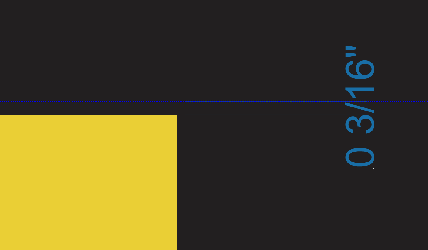
This is a shot of a 92" span, dropping 3/16".

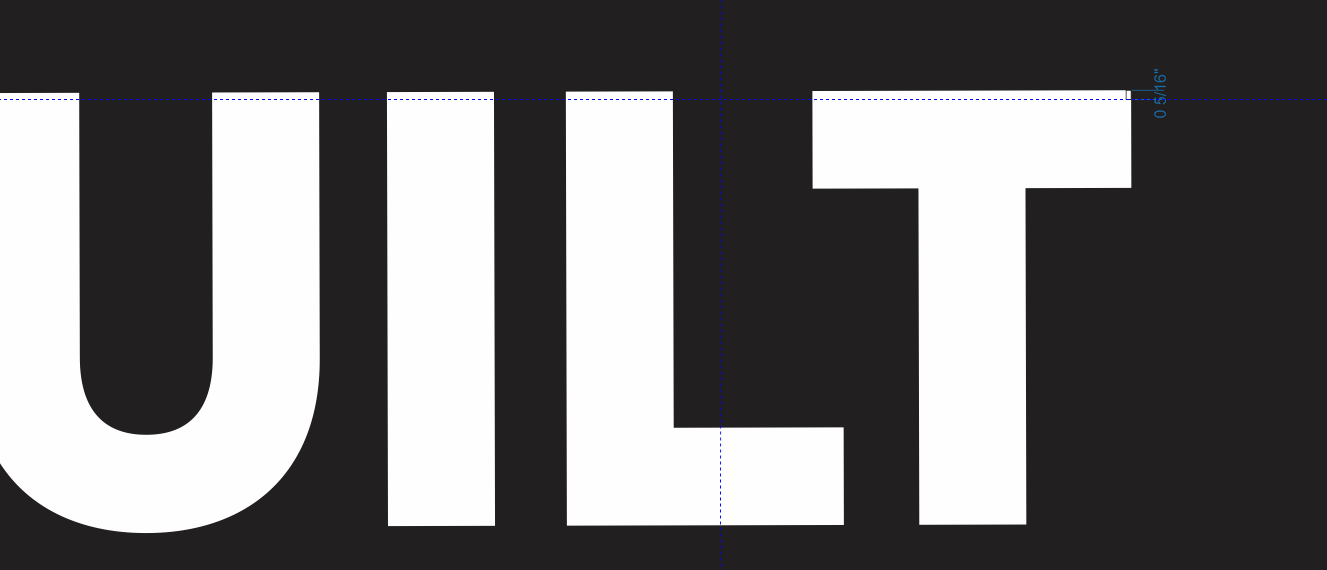
Here's another at 10' span raising 5/16". On the same layout no less!
It's asinine, and all I can figure is literally a disgruntled employee giving one last fu before retiring/firing. Anybody ever seen this with such a 'large' company? They're not what I'd consider national, but at $70+ million a year, you'd think their logo would be straight.
This is a shot of a 92" span, dropping 3/16".
Here's another at 10' span raising 5/16". On the same layout no less!
It's asinine, and all I can figure is literally a disgruntled employee giving one last fu before retiring/firing. Anybody ever seen this with such a 'large' company? They're not what I'd consider national, but at $70+ million a year, you'd think their logo would be straight.

