• I want to thank all the members that have upgraded your accounts. I truly appreciate your support of the site monetarily. Supporting the site keeps this site up and running as a lot of work daily goes on behind the scenes. Click to Support Signs101 ...

Thoughts on this design?

High Octane

New Member
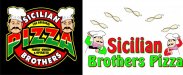
Pizza place asked me to redesign their logo (the one on the right)...they wanted to have some kind of likeness of each owner incorporated in the design...similar to the way their old logo was done....any thoughts on the one I'm working on for them? (left one)
 

Attachments

  • broslogo.jpg
    broslogo.jpg
    61.2 KB · Views: 82

Billct2

Active Member
I like it, but I like the old caricature style more than the new ones, simpler friendlier looking
 

Craig Sjoquist

New Member
I like it .. looks good and tight .. but agrees with Billct2... I would widen the logo like the old and place in the friendlier Pizza caricatures, tossing pizzas but one each or just one but likes your drawings of them better.
 

ova

New Member
Are those two guys twins or just brothers?

Couple of things I see:

1. Maybe make them smile a bit more
2. Seems like their hats are too close to the text. I would move them out ever so slightly.

Other than this, it looks good to me. So how's their pizza taste?

Dave
 

High Octane

New Member
The brothers actually look a lot alike...one is just fatter than the other and I really wanted to make a point of not stressing the fat factor so I slimmed him down a bit....They liked the harass look rather than the happy smile guys....couldn't argue
 

Jillbeans

New Member
I like what the original caricatures are doing.
And if the one guy is chubbier make him chubbier, they look too much alike if they are not twins.
Maybe make one raising an eyebrow and looking at the other one.
Love....Jill
 

signmeup

New Member
The word "pizza" would stand out way better if it was white. The bros remind me a bit of the Pep boys.
 

High Octane

New Member
This is what they look like...the made me put the big Italian stash on them
 

Attachments

  • thebrothers.jpg
    thebrothers.jpg
    31.9 KB · Views: 123

Gino

Premium Subscriber
Well, at least we now know where all the profits are going and what ends up with the leftovers.

I believe the logo looks good. The colors are strong, but too many of them are too close together to get much contrast for a decent sign. Give it the squint test and you'll see what I mean.... or print it out on a 8.5" x 11" and stand about 15' away from it and look at it quickly. Don't study it. Most peoples' time to view a sign is between 2 and 3 seconds.
 

Jillbeans

New Member
Make the "big" brother tossing the "little" brother like a pizza.
And yes, PIZZA would look 100% better in white.
Maybe switch the inner yellow circle to green if they're insisting on the traditional colors.
 
Top