Firepowertx
New Member
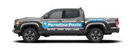
Hey guys! I tried searching but couldn’t really find what I was looking for. What ballpark would y'all charge for doing a truck like the one below? Turn key from design to install.


Indeed. "Cheapest..."The back quarter panel says it all
Other than the font, what would you do differently?Looks like they got it from the cheapest vinyl letters in town place. Doesn't even use the same font as their sign.
Other than font, what in your opinion would make the design better?my design ould be better than that but I would be looking bout $700-800
Really? It's not that much coverage. The hardest part would be running that palm tree across the window area. I'd probably be around $500-600 installed.Y'all are way too low.
The entire thing.... At a MINIMUM add a white outline. And read a book on color...Other than the font, what would you do differently?
The entire thing.... At a MINIMUM add a white outline. And read a book on color...

Why don't you tell us what you charged, so we can see where you're at?Is this a good start?
View attachment 172603
I did have to talk them out of adding gold… I do appreciate the feedback and will work on adding things when I am collaborating with clients. I am fairly new at this and kind of just fell into it so I’m trying to learn as I go. I want to keep getting better but design has never been my strong suit, as you all seem to agree.
Is this a good start?
View attachment 172603
I did have to talk them out of adding gold… I do appreciate the feedback and will work on adding things when I am collaborating with clients. I am fairly new at this and kind of just fell into it so I’m trying to learn as I go. I want to keep getting better but design has never been my strong suit, as you all seem to agree.
It’s a friend so I haven’t charged yet but I was thinking about the $600-$800 range. They picked the colors which do match their brand but the outline would have helped, I just didn’t think to add one. The font actually matches an older sign they have, that big one got installed later and I missed changing the font. I should have paid better attention to that.Why don't you tell us what you charged, so we can see where you're at?
And it doesn't matter if we like the design or not, All that matters is if the customer likes it.
I've put out some of the worst shit I've ever seen... Couldn't talk the customer out of it. They loved the end product...
It's not... bad per se, and maybe its on brand with their branding. I would have added a white border to it... Maybe stuck with their blue, Done it in the same font as their logo... I get the green tree, but their logo / branding its blue... Maybe kept it consistent? Well, to be honest I wouldn't have touched it... I'm not a graphics designer, and I know my limitations in graphic designing! I'd have made the above changes, and maybe it'd have been slightly better, easier to read... but still not "professional". Thats why we have graphics artists, or even freelancers we hire for stuff like this... I do what I'm good at, and let others do what theyre good at
Thanks. I’ll look for those. This is very helpful.Look up "Light Reflective Value" You want contrast between text and background. The colors you use have too close of LRV to the truck paint to be seen easily, that's why adding a white border or background like Visual did makes it look more professional. There are also books on sign layout that will be helpful. There are trade magazines out there with design ideas.. and there's always good to search for other car designs to get inspiration hopefully from people that did it well.