• I want to thank all the members that have upgraded your accounts. I truly appreciate your support of the site monetarily. Supporting the site keeps this site up and running as a lot of work daily goes on behind the scenes. Click to Support Signs101 ...

A couple new fonts I recently designed.

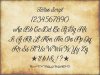
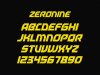
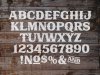
I made both of these in the last few months. The western style 'spurred' font took a couple of weeks of work off and on, probably more so in setting up kerning pairs which were extensive and I still have probably another week's worth of fine tuning to do. The more geometric one was a pretty simple undertaking and only took about 5 hours to create, but doesn't yet have kerning pairs. It's mostly monospaced though, so it shouldn't take too much work.

Let me know your thoughts and any suggestions. Thanks for looking.

attachment.php
attachment.php
 

Attachments

  • Richter sample.jpg
    Richter sample.jpg
    315 KB · Views: 118
  • Silverthorne copy.jpg
    Silverthorne copy.jpg
    246.8 KB · Views: 87

Marlene

New Member
not trying to be a jerk but I feel like I've seen both of those fonts as they are so close to existing ones. I'd love to see a new one that was unlike any font out there
 
not trying to be a jerk but I feel like I've seen both of those fonts as they are so close to existing ones. I'd love to see a new one that was unlike any font out there

Understandable. I'll post some more tonight to show you some that are a bit more original and uninspired by other fonts. I don't have a lot of my newer font files handy at work to post. The western style font was inspired by Boston Truckstyle, as I really like the style of that font, but I wanted something less flashy without all the flourishes that could be used for more commercial projects. The other one was in fact inspired by Moonshiner but I wanted something with both upper and lower case, so a lot of my fonts that I design just come out of necessity.

Nice. On the western font check your R. It is missing the little spur that is on every other letter

Thanks for pointing that out. That's why I posted these to get some feedback. I'll have to fix that little oversight.
 

Marlene

New Member
Understandable. I'll post some more tonight to show you some that are a bit more original and uninspired by other fonts. I don't have a lot of my newer font files handy at work to post. The western style font was inspired by Boston Truckstyle, as I really like the style of that font, but I wanted something less flashy without all the flourishes that could be used for more commercial projects. The other one was in fact inspired by Moonshiner but I wanted something with both upper and lower case, so a lot of my fonts that I design just come out of necessity.


Thanks for pointing that out. That's why I posted these to get some feedback. I'll have to fix that little oversight.


thanks for taking my comment in the spirit it was intended! I am looking forward to seeing some of your other fonts
 
Here are a few originals, Marlene. You'll be hard pressed to find any fonts even remotely similar to Tattoo Script, Zeronine, and Maxx Voltage. I have a few others that are completely original, but haven't done any specimens of them yet, mostly because I'm too busy always working on new fonts. This started as a hobby a couple years ago, but now I'm designing around a dozen new fonts a year. I don't have any intention to sell them at the present time, but I may eventually. Right now I just enjoy being able to use them in my own design projects.
 

Attachments

  • Tattoo Script sample 2 small.jpg
    Tattoo Script sample 2 small.jpg
    51.9 KB · Views: 50
  • Tattoo Script small.jpg
    Tattoo Script small.jpg
    71 KB · Views: 40
  • Tattoo Script sample small.jpg
    Tattoo Script sample small.jpg
    25.8 KB · Views: 63
  • Zeronine small.jpg
    Zeronine small.jpg
    615.9 KB · Views: 51
  • Maxx Voltage small.jpg
    Maxx Voltage small.jpg
    137.5 KB · Views: 39
  • Maxx Voltage Sample.jpg
    Maxx Voltage Sample.jpg
    98 KB · Views: 48
  • Maxx Voltage Lorem copy.jpg
    Maxx Voltage Lorem copy.jpg
    87.1 KB · Views: 47

SightLine

║▌║█║▌│║▌║▌█
Excellent work on all of them! Please do keep us posted if you decide you might want to sell any.
 
Top