• I want to thank all the members that have upgraded your accounts. I truly appreciate your support of the site monetarily. Supporting the site keeps this site up and running as a lot of work daily goes on behind the scenes. Click to Support Signs101 ...

Attempt at my logo

SignManiac

New Member
Nice concept and direction John. After reading the OPer's intended direction, I would design a completely different logo than my previous attempt. That one was done more to show how I would deal with johns confusion about incorporating his JM initials into his reworked design.

I have a completely different vision in my head now. Maybe I'll throw another idea up over the weekend. Going out to raise some he'll tonight!
 
J

john1

Guest
Here is a idea going off Deaton's concept, Too simple?
 

Attachments

  • Untitled-2..jpg
    Untitled-2..jpg
    46.3 KB · Views: 94
J

john1

Guest
your best yet by light years John!!

How do you like it?

I think it's got great potential, as is, or if you take it even further...

I really like it, But i'm afraid it's too basic. I really want to do more quality work. I'm so tired of doing these little jobs and not doing anything like you guys on here do. I know everyone gets these small jobs but i really am tired of people not appreciating my time because i know what i can do i just don't get a chance.

The way i see my current concept is by keeping JM and Graphics one color, it reads together, then the "&" is less important so it's a lighter color and SIGNS jumps out with the brighter color i used for it.

The long box below i think can be changed for my website, phone number, motto, city, state etc for whatever i need to for whatever use.

Any suggestions guys? Thank you in advance!

Here is another way i could do it so graphics as well as signs stand out and i changed the slogan just to go with how simple the logo is.
 

Attachments

  • Untitled-2.jpg
    Untitled-2.jpg
    22.1 KB · Views: 96
Last edited by a moderator:

Jon Aston

New Member
Echoing iSign's earlier comments...

I think that in order to become a better designer (and a better sign designer) you need train yourself to evaluate and analyze design - to look at what works (and why) and what doesn't work (and why) - and to practice deconstructing and reconstructing designs to understand how various design elements work together.

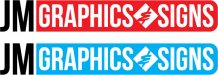
For example, take Neato's inspiring design and look at what works and why. I'm not a designer but I can still look at that design and recognize a few qualities that work and that I might experiment with in my own attempts at design, and/or would want to research further:

Those aren't your average free windows fonts. Where did he get them, why did he choose them? How do they work together? Where could I learn more about selecting/combining fonts?

Colours. Cooler colours to the back, warmer colours to the fore. Do those colours work together? Why? How could I learn more about how to choose and combine colours?

Movement. How do I read that design? Where do my eyes start, where do they stop? What's the lasting impression? In this case, I'm not reading left-to-right, but more top-down.. starting with "Graphics", then ending on JM. I actually take the time to take it in twice, which is unusual. Why? "Graphics" is dominant: Display font, largest word, and warmest colour pushes it to the foreground. But there's more than just that at work. There's the background shape. And look at the "gradients" (including rule/line spacing in the blue) and the way they blend with outlines.

You get the idea. I'm sure some of the trained eyes here can expand and improve on (and probably correct) my analysis. But you get the point. So what can you take from that and apply in your own design attempts? Or - better yet - let's see some analysis of John Deaton's equally inspiring design, and some attempt to apply that to your own attempt.
 
J

john1

Guest
I have the Logo 1 and 2 books from Dan Antonelli on the way from Amazon. Should be here 5-8 business days....I hope they help me alot
 

SignManiac

New Member
Smart investment John. Also, start deliberately looking at and studying every logo you see and try to analyze what it is you like or dislike about them. My personal opinion is that the simplest ones are the hardest to design but the best for a good brand.
 
J

john1

Guest
I notice alot that known brand logos are not really explaining what they do, rather than the name. Take nike for instance, it's just a check mark. Who would know it was shoes if you didn't know they made shoes from all the ads and stores around?

I don't really get that but maybe that's something to do with how diff industries design.

I can't wait until the books come in!
 

SignManiac

New Member
What Nike did has more to do with branding. The old AT&T logo use to be a sphere with striped lines through it. Everyone knew it was AT&T without have to explain it.

Anyway, after learning the direction you want to go, I came up with this basic black logo that would, could, identify with trucks, windows and banners. It has a custom look and says what you do. With this you could come up with fifty spin offs just using the basic design. And here it is reversed on a rectangle panel but it could work on an oval or some other shape.
 

Attachments

  • JM graphics5.jpg
    JM graphics5.jpg
    48.2 KB · Views: 84
  • JM graphics6.jpg
    JM graphics6.jpg
    53.1 KB · Views: 96

ontsigngirl

New Member
suggestion

The way i see my current concept is by keeping JM and Graphics one color, it reads together, then the "&" is less important so it's a lighter color and SIGNS jumps out with the brighter color i used for it.

The long box below i think can be changed for my website, phone number, motto, city, state etc for whatever i need to for whatever use.

Any suggestions guys? Thank you in advance!


This is a rare opportunity to do something strictly for yourself because in this case you are the customer and in the long run you have to feel good about what you've created. The people on here have great technical and practical advise - really this is also an exercise about doing what represents you and your work.

From what I've seen your logo attempts don't tell me anything about you. What are your strengths? What do you want to be known for? Are you a great illustrator? Is type your strength? Cartoons? It's been asked time and time again what makes you different from the crowd?

I understand you want to do the right thing as a "sign guy" but you also NEED to make your own mark. Ask yourself the same questions you'd ask a customer. Fonts, colours and layouts are important but so is individuality which means thinking outside the box.

Hope this helps.
 
J

john1

Guest
Hey everyone! This thread is old but i am trying to get something fresh going again.

See attached, Thoughts and comments are always welcome.
 

Attachments

  • Untitled-1.jpg
    Untitled-1.jpg
    59.9 KB · Views: 86
Last edited by a moderator:

TyrantDesigner

Art! Hot and fresh.
oooo ... I like this last one. It is simple, has flexibility and is not over crowded with info. Not much I can say about it since this is a transition from the last ones. Good logo though.
 

Marlene

New Member
I would change the font to something not condensed as it looks crushed. also, the corner radius on the end might look better with square corners. really like the idea of this as it is simple.
 
J

john1

Guest
Thanks everyone, I really appreciate your comments.

Now to figure out what color shirts the blue logo concept should go on. Lime possibly?
 
Top