-
I want to thank all the members that have upgraded your accounts. I truly appreciate your support of the site monetarily. Supporting the site keeps this site up and running as a lot of work daily goes on behind the scenes. Click to Support Signs101 ...
You are using an out of date browser. It may not display this or other websites correctly.
You should upgrade or use an alternative browser.
You should upgrade or use an alternative browser.
Rick
Certified Enneadecagon Designer
Here's another quick idea for you...
That is a sweet logo Neato... a corn dog for you!

SignManiac
New Member
Very nice Neato!
iSign
New Member
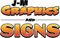
To me a logo should tell you what the business is without having to read the description. The imagery should give some idea as to what the business does without having to read "graphics and signs."
yeah... like formanek's logo!
http://www.proskinzanddesign.com/images/sign.jpg
stoneandtle
New Member
Here's another quick idea for you...
Wow that looks great
J
john1
Guest
Neato that looks very nice!
Now how would a logo like that work in grayscale though? That's what has me hung up really. To make a logo thats versatile in any color mode or should this not really matter?
Now how would a logo like that work in grayscale though? That's what has me hung up really. To make a logo thats versatile in any color mode or should this not really matter?
stoneandtle
New Member
This may or may not be relevant, but I use software that converts full color images to grayscale and use those images for laser engraving stone. The software is called PhotoGrav - you can convert any image to a grayscale image (pixelated image). Not sure if this will help you, but you may want to check it out.
I can post a sample of the output using Neato's design tomorrow when I get in the office.
I can post a sample of the output using Neato's design tomorrow when I get in the office.
iSign
New Member
John,
with all due respect, I'm going to suggest what I honestly consider to be the best way to answer that question for yourself... and this suggestion has 2 parts...
I've done some design work in the past, where I've asked for advice from the pros I look up to, and sometimes ya don't get much... sometimes ya get lucky a read a few comments... sometimes you really hit the jackpot & have these guys laying hundreds of dollars of design time at your feet...
when that happens, at least for me, when that has happened, I know that this was done to TEACH me, because I said I wanted to learn... so when I would start with something like you started with & someone posts something like Neato did... what's my next move? posting more questions? asking these designers to explain their contributions? NO!! ...I go to the drawing board, I try to build my own versions of their ideas... and when I have that done, if i have questions about how it works in black and white? ..I draw it in black and white, see what happens... fix anything I don't like by experimenting.. these guys are showing you the way... not delivering you to your destination...
go draw up something & then come back.. show everyone what you can do with the knowledge, make an effort to answer your own questions first, and show us that... before this thread is over, the lessons you put in practice & come back showing your results, will end up being lessons where other people learn from you! I KNOW this to be true!! I've done just what I'm suggesting, AND I've seen it dozens of times... if you just ask questions, you will get help, but it will do X amount of good, and the thread will die in Y amount of time... BUT, if you go and draw more, and come back with drawings, showing that you are using this valuable information... guaranteed, you will get 10X amount of good, and the thread will continue 2X to 3X times as long...
Rick
Certified Enneadecagon Designer
First... don't get so hung up on grayscale... and in actuality, it should be black and white... gray should not be used as that is just a simulation of color... black and white is used to see issues with the layout and if you need a black and white version.
NO LOGO SHOULD BE DESIGNED USING THE LOWEST COMMON DENOMINATOR.... Saul Bass and Paul Rand are spinning in their graves, but technology is so much more advanced, that black and white is an extremely rare occasion, so why should it dictate the finish product?
NO LOGO SHOULD BE DESIGNED USING THE LOWEST COMMON DENOMINATOR.... Saul Bass and Paul Rand are spinning in their graves, but technology is so much more advanced, that black and white is an extremely rare occasion, so why should it dictate the finish product?
Last edited:
iSign
New Member
here's a grayscale of neato's work...
and a second with the contrast bumped...
if I drew this in vector, I would try to do a black & white version, and maybe a second version allowing one shade of gray. My higher contrast one is almost like that..
I agree with rick... that concept has a purpose, but it's not to say the exact finished logo needs to be able to redraw as black and white... it's a tool to help strengthen design skills & improve legibility...
but it's also an important consideration for low cost newspaper ads, cheap flyers & other promotional hats, pens post-it notes or whatever... so even a simplified version could be better then never doing those promotions because a full color logo can't be done...
Attachments

iSign
New Member
Last edited by Rick; Today at 10:44 PM. Reason: cursed engrish.... thanks ISign
Reply With Quote
ah-haaa... I wondered about your engrish there for a moment... glad I could interpolate correctly...

John Butto
New Member
new B/W logo
anti cartoon
anti cartoon
Jillbeans
New Member
I like John's idea with the JM in back, but with way opened up kerning.
I would go with the J-M rather than J.M. just because it looks more "corporation" like.
I don't like seeing a cursive capital J beside a cursive capital M.
I would highlight the signs part because to me that seems classier than graphics (which makes me think of a guy with a plotter in a stall at the flea market making peeing Calvins)
Also if you are not super adept at graphic designs, emphasize the signs part.
Here's a quick suggestion both simple and tarted up.
I would also avoid too cartoonical a look, after all, you want to be taken seriously.
Love....Jill
PS
I originally had this on an orange background.
Attachments

stoneandtle
New Member
Neato that looks very nice!
Now how would a logo like that work in grayscale though? That's what has me hung up really. To make a logo thats versatile in any color mode or should this not really matter?
Just in case anyone is curious, here's what that logo would look like (this is just a raw export) as a black and white then converted to grayscale. Obviously, would require some clean up, but it shows it can be done without having to rework it entirely. I'm posting this just to answer his question about what it would look like as a grayscale logo, so please keep the flaming low lol
")
Attachments

J
john1
Guest
Thanks everybody! Jill i like your design set up but i guess the font and colors i chose does look alittle cartoony.
I'll need to place with some ideas, I guess what i originally thought looked good was a sign layout rather than a logo.
I almost feel im trying to be something im not, Idk it's easy for me to get discouraged i guess.
I'll need to place with some ideas, I guess what i originally thought looked good was a sign layout rather than a logo.
I almost feel im trying to be something im not, Idk it's easy for me to get discouraged i guess.
J
john1
Guest
kylebrk
New Member
Here's another quick idea for you...
FANTASTIC! two thumbs up!