-
I want to thank all the members that have upgraded your accounts. I truly appreciate your support of the site monetarily. Supporting the site keeps this site up and running as a lot of work daily goes on behind the scenes. Click to Support Signs101 ...
You are using an out of date browser. It may not display this or other websites correctly.
You should upgrade or use an alternative browser.
You should upgrade or use an alternative browser.
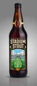
Beer Label Design
- Thread starter Joe Diaz
- Start date

Joe Diaz
New Member
loli'm a pats fan sooooo.....
Pat Whatley
New Member
Ball is facing the wrong way.
Laces Out Dan!
Laces Out Dan!
Joe Diaz
New Member
Ball is facing the wrong way.
Laces Out Dan!
Nice. I was wondering when someone would catch that. LOL
Joe Diaz
New Member
I'm assuming you guys are just joking around, but in case you are not, it's called hops. A pretty important ingredient in most beer. https://www.google.com/search?q=hop...a=X&ei=MHBaVYOiMYrRsAW13IGgBg&ved=0CAYQ_AUoAQ
But an artichoke beer. Hmmm, wonder what that would be like. Someone has probably made it by now.
But an artichoke beer. Hmmm, wonder what that would be like. Someone has probably made it by now.
Jillbeans
New Member
Try it without the green glow on the name and that ball stand thingy.
If hops are dried and not as green before use, maybe that might be a better color choice for the football part. I just don't like green with beer unless it's St. Patty's day.
I like the layout, though.
Love....Jill
If hops are dried and not as green before use, maybe that might be a better color choice for the football part. I just don't like green with beer unless it's St. Patty's day.
I like the layout, though.
Love....Jill
Pat Whatley
New Member
Cause it's not made from hooves. It's made from hide, bones, ligaments and connective tissue which is much. much more appetizing. :Big Laugh
Joe Diaz
New Member
I just want to point out. The project is already done, sold, produced. So keep the comments and suggestions coming, but I say all this because I just don't want anyone to get upset when I don't make the changes they suggest. However, your opinions are noted and will be considered moving forward.
bob
It's better to have two hands than one glove.
I'm assuming you guys are just joking around, but in case you are not, it's called hops. A pretty important ingredient in most beer. https://www.google.com/search?q=hop...a=X&ei=MHBaVYOiMYrRsAW13IGgBg&ved=0CAYQ_AUoAQ...
If it has to be explained then it's not working. My first impression was a brussels sprout, possibly the most disgusting vegetable on the planet.
Joe Diaz
New Member
Jello is made from ground up animal hooves and you don't see any hooves on their packaging.
Yeah but you do see hops, wheat/barley etc on beer labels all the time. Especially craft beers, which this would be, And the craft beer consumers, the target audience, know what hops look like, and the "hoppiness" of a beer for these types of consumers are important. They will respond well to imagery that incorporates that ingredient, which is apparent when you go over the market research on this.
Here is a site dedicated to beer label designs, many of which are way better than what I've created here, however you will notice Hops imagery on many of them.
http://www.ohbeautifulbeer.com/
Even some of the major brands have the ingredients of the beer incorporated in the design.
Attachments
Joe Diaz
New Member
If it has to be explained then it's not working. My first impression was a brussels sprout, possibly the most disgusting vegetable on the planet.
I don't have to explain it to the target audience. They know what hops are, and the illustration resembles hops.
I don't have to explain it to the target audience. They know what hops are, and the illustration resembles hops.
As a lifelong craft beer lover and long time home brewer as qualifications, I'd respectfully point out that perhaps the reason some of those here including myself mistook your rendition of a hops bud as being morphed into an artichoke, or other vegetable is because that is what it looks like to us.
I've seen and consumed thousands of different craft beers in my life and frankly have never seen a hop bud rendered quite as "creatively" as you did it. I know its tough to get some less than gushing feedback in the rarified air you operate in, but some of us do have eyes and don't need to stand corrected or be condescended to just because we pointed something to someone so talented as yourself.