• I want to thank all the members that have upgraded your accounts. I truly appreciate your support of the site monetarily. Supporting the site keeps this site up and running as a lot of work daily goes on behind the scenes. Click to Support Signs101 ...

Can somebody explain font numbers to me?

Pat Whatley

New Member
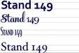
I don't get it....why do some fonts have numbers that fall below the baseline?

While I'm at it why do some fonts have numbers that are half the size they say they are. I've got several that if I'm typing 2" letters and enter a number the numbers come out at 1.25" tall.

Heck, as long as I'm on stupid typography questions why do font designers seen to mail it in when it comes to basic punctuation? One of my pet peeves is typing in "$" and getting an S with a line through it that looks ridiculous next to a number the same size.

I don't care if it's because back during OP's days they ate too much lead type and that's just how they did it....these are computer fonts, it could have been easily corrected.

I'm gonna go mug some old ladies and kick some baby seals and stuff like that to get back in the Christmas spirit.
 

Attachments

  • 1112.jpg
    1112.jpg
    13.3 KB · Views: 86
  • Untitled.jpg
    Untitled.jpg
    43.6 KB · Views: 45
  • 123.jpg
    123.jpg
    38.6 KB · Views: 50

Gino

Premium Subscriber
I'm with ya on this one. I'm sure there's a better explanation than OP did it, but whatever it is, it's got to be stoopid.

When executing these things by hand, it was always done perfectly. Now, ya hafta d!ck around for a few minutes to get one little part correct. And if you're doing a menu, make sure the copy & past feature are in full blown mode. :design:


Ya can go one further. Why don't they have a few number fonts of only numbers and symbols alone.... that are seriously good, instead of the crap which just resembles the font you happen to be using at the time ?? :banghead:
 

bob

It's better to have two hands than one glove.
Some type faces, perhaps in an attempt to be arty, use the descender space for tails on certain numerals and symbols. Most of these faces were originally designed a 100 or so years ago, some a lot older than that.

Maybe before the era of mechanical printers these faces were an attempt to duplicate how numerals were written with quill pens by eye shade wearing accountants and others.Perhaps just for the aggravation value.
 

The Vector Doctor

Chief Bezier Manipulator
I don't know the official answer but I do know that in Illustrator you can have it type out normal number heights if you turn off by clicking on "proportional lining" on the opentype tab. It only works with Opentype fonts that have full character sets.
 

Attachments

  • Screen Shot 2014-12-22 at 12.08.33 PM.png
    Screen Shot 2014-12-22 at 12.08.33 PM.png
    13.3 KB · Views: 51
  • Screen Shot 2014-12-22 at 12.09.31 PM.png
    Screen Shot 2014-12-22 at 12.09.31 PM.png
    18.1 KB · Views: 47

shoresigns

New Member
This isn't strict by any means, but the general rule of thumb in typography would be that the mixed-height numerals are to be used in body text, while the capital-height numerals are to be used in headlines and display text.

The reasoning is that the mixed-height numerals are essentially "lowercase" numerals, so the mixed heights flow better in a block of text, whereas the capital-height numerals stand out as a "dark" spot in the block of text.
 

shoresigns

New Member
Also, to answer your second question, a dollar sign is supposed to be a capital S with a line through it. In this case, that's what looks best in a block of body text. If you're using the dollar sign in a headline or display text, then the appropriate thing to do would usually be to use superscript, not shrink it down slightly and centre it vertically - that definitely looks weird.
 

Gino

Premium Subscriber
Also, to answer your second question, a dollar sign is supposed to be a capital S with a line through it. In this case, that's what looks best in a block of body text. If you're using the dollar sign in a headline or display text, then the appropriate thing to do would usually be to use superscript, not shrink it down slightly and centre it vertically - that definitely looks weird.


Yeah, I don't know where you got that theory, but it's a little off track to say the least. Simple googling and going to Wikipedia will tell you far more in depth as to the history and coming about of the dollar sign. It's actually, quite interesting. :rock-n-roll:
 

shoresigns

New Member
Yeah, I don't know where you got that theory, but it's a little off track to say the least. Simple googling and going to Wikipedia will tell you far more in depth as to the history and coming about of the dollar sign. It's actually, quite interesting. :rock-n-roll:

I stand corrected. I should have elaborated - a dollar sign certainly wasn't derived from the letter "S". I was just referring to the size; I meant that a dollar sign is typically more similar in size to a capital S. Sometimes a bit smaller, but not reduced and centred vertically like in Pat's original example. The lower curve of the "S" and the dollar sign should both be on the baseline and the bottom end of the vertical stroke in the dollar sign should extend below the baseline.
 

Pat Whatley

New Member
I stand corrected. I should have elaborated - a dollar sign certainly wasn't derived from the letter "S". I was just referring to the size; I meant that a dollar sign is typically more similar in size to a capital S. Sometimes a bit smaller, but not reduced and centred vertically like in Pat's original example. The lower curve of the "S" and the dollar sign should both be on the baseline and the bottom end of the vertical stroke in the dollar sign should extend below the baseline.

Again....who told you that?
 

Jwalk

New Member
I agree it is a cool thread I would see more of these kind of articles. I ussually see more technical threads about machinery.

Enjoyed the part about the headline number and body text number makes sense to me.
 

shoresigns

New Member
Again....who told you that?

Also, I just realized you might have been questioning the other part of my statement, that the dollar sign isn't derived from the letter "S". The two symbols "S$" have different lines of evolution, which explains why if you subtract the vertical line from a dollar sign in many fonts, it still looks like it was intentionally designed to be distinctly different from a capital "S". This observation applies more with serif fonts of course.
 

Gino

Premium Subscriber
Fonts. Fonts told me. Go to http://wordmark.it and type "S$" to see for yourself.

We do need more of these threads though, I agree. I love typography and I certainly have more to learn myself.

Well, if you'd go one step further and type in $sS, you'll see there are more variations than yours had shown to begin with.

I'm no typographer or anything remotely close to it, but doesn't it stand to reason, back when the US currency, along with Canadians, Spanish and other dollar signs were coming about, that there were no specialized fonts, let alone rules on $ signs ?? People just wrote in natural hand-script and embellished most letters they could to dress it up. As the PS symbol became more popular, it just developed into what we now have. An 'S' type of symbol with one or two lines running through it. Placing it high on the line or low seems to be more of a personal preference. Come along the type writer, there had to be a decision made to standardize it. It is what it is. However, with the aid of computers, if one chooses to embellish it, like in the olden days, I don't see how anyone can make a call as to right or wrong. Depending on where and how I'm using them or making a menu or some other need for dollar signs, I make them various ways, and go with the one I think aesthetically looks best. As for what comes out of some font collection or off the internet arguments, it still is a personal preference. This symbol along with many others have a myriad of possibilities. There is no one standing rule. A stock $ is a real waste of time in sign making. Letter writing is a different story.
 

The Vector Doctor

Chief Bezier Manipulator
I personally feel that a full sized $ sign on a menu is distracting. Many of the old hand lettered chalkboards or paper tags have the smaller dollar and cent symbols. I don't think any of these would look good with a full sized dollar sign
 

Attachments

  • price3.jpg
    price3.jpg
    128.3 KB · Views: 41
  • price2.jpg
    price2.jpg
    16.1 KB · Views: 45
  • 2c6bc1d099bc490eb8366adc2b733b29.jpg
    2c6bc1d099bc490eb8366adc2b733b29.jpg
    21.6 KB · Views: 43
Top