• I want to thank all the members that have upgraded your accounts. I truly appreciate your support of the site monetarily. Supporting the site keeps this site up and running as a lot of work daily goes on behind the scenes. Click to Support Signs101 ...

Critique please......

signmeup

New Member
Looks like this on my monitor. I'm guessing the wide white bar should be one piece?
 

Attachments

  • Webshot.jpg
    Webshot.jpg
    55.2 KB · Views: 108
Last edited:

NY Signman

New Member
Any ideas as to sizes to accomplish the "universal" view? #'s if possible?

I attached how it looks in mine....thought it was the same everywhere. OH BOY!

Let me know what you guys think I should do?

BTW, my van is getting a re-do......just before the critiques start for that. :)

Thanks
 

Attachments

  • website.jpg
    website.jpg
    67.3 KB · Views: 97

artist4christ

New Member
Any ideas as to sizes to accomplish the "universal" view? #'s if possible?

I attached how it looks in mine....thought it was the same everywhere. OH BOY!

Let me know what you guys think I should do?

BTW, my van is getting a re-do......just before the critiques start for that. :)

Thanks

Keep tabs on resolution spec, right now it is ok to use 1024 x 768 as the base resolution so general rule of thumb is to keep the main area withint 1000 x 700 of course larger than 700 isnt a big deal just make sure the most important infromation is above that break.
 

J Hill Designs

New Member
Any ideas as to sizes to accomplish the "universal" view? #'s if possible?

I attached how it looks in mine....thought it was the same everywhere. OH BOY!

Let me know what you guys think I should do?

BTW, my van is getting a re-do......just before the critiques start for that. :)

Thanks

even with your widescreen monitor, looks like you have to scroll as well...
 

NY Signman

New Member
Yeah....I need to scroll a little.

I'm trying to accomplish this reduction in size, but it looks like I need to format everything....picts, text, boxes,etc....

Wish I could just press the correct page sizing in and everything would format accordingly!

Just trying to see if I don't need to redo everything for each page...but guessing that I do?

I'll keep updating as I go, and have time in-between jobs.

Thanks
 

neato

New Member
No ideas for the site...I was just excited to see someone from Pine Bush. I lived there for a year and a half.

Long live Pete's Pizza.
 

noregrets

New Member
Mate, with all due respect your site is not very good. It is very hard to follow and the different components on it are very disjoint - there is no flow.

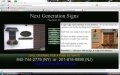
For a start, if you are going to have that slideshow there, move it to the right hand side, I cant read your blurb on the right, because everytime the slide changes, my eye gets drawn back to the slide show.

That navigation in the middle does nothing for me. It is really hard to read, and in the wrong place.

Is there a reason why you have used Times New Roman for your heading?

There is no consistency in the font size on your pages either, some is smaller and some is bigger.

That gradient on the bottom renders really badly

And as said above, the site is waaaaaaaaay to wide.

This may sound rough, but I would honestly start over, in my opinion this site does not do your business any favours. You say on your homepage 'A sign is the representation of your business', so is a website and can you honestly say that this website honestly represents your business??

Do some research into what works well in a website - have a look around at other sites, there are plenty of good and bad ones out there - note what works well and what doesnt and then start again with yours.

Sorry, not trying to bag you at all - just being honest with my 2 cents.

Hope that helps
Rob
 

NY Signman

New Member
Guys,

Sorry for delay....I was actually working on it in stages and not checking back into this.

Neato.........Pete's!!!! I've never eaten there. Usually the HOOT OWL is best for pizza IMO! You should remember that place! Walk in the door and record needle scratches off the song if they don't know you! : ) Know any names I may know of?

Signmeup...software that was with webstarts....their templates, fonts, etc.

Noregrets...no problem...I asked for a critique. It sucks to have spent a good amount of time (I know you guys do see it) and not be where I hopped to be! I have NO training on websites...this was my first attempt. I guess attempt is used lightly! And yes....I totally agree that this isn't "the" representation I'm looking for! I just hate wasting time....but I guess that's learning!

Thank you..... keep'em coming!
 
Top