• I want to thank all the members that have upgraded your accounts. I truly appreciate your support of the site monetarily. Supporting the site keeps this site up and running as a lot of work daily goes on behind the scenes. Click to Support Signs101 ...

Font for truck lettering

gfreeman

New Member
Hi all,

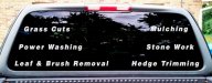
I'm looking for a recommendation for a Font that is easy to read, cut and sans serifs.

So far I have Helvetica LT STD bold, but the letters are not tall enough. When I go up in size and reduce tracking, they become too squished and hard to read.

Any suggestions?
 

Attachments

  • truck-window.jpg
    truck-window.jpg
    47 KB · Views: 367

slipperyfrog

New Member
Papyrus and Bleeding Cowboys fonts can make some bitching layouts for trucks. Try mixing them up a bit and see what you come up with.

Please post pics when done!
 

visual800

Active Member
you have a back window with already too much on it. Its too spaced out and hard to keep focus on the read. wheres your logo at> where your phone number?
 

Jillbeans

New Member
Explain please...
They mean that it looks as if you need to learn some simple layout rules.
Your copy is run straight to the edges, with way too much space between words.
All I see is the huge hole in the center.
A left-justified short bulleted list might look nicer, that or something like this
GRASS CUTS • MULCHING
POWER WASHING • STONEWORK

center-justified on the back.
What you have looks very unprofessional.
Have you read "Mastering Layout" by Mike Stevens? If not, you should.
I love his "Arroyo" font.
Also, lettering needs to not be shrunk or stretched to fit.
You did ask the right question by trying to find the right font to suit the job.
Love....Jill
 

gfreeman

New Member
Thanks for the patience Jill,

I will definitely pick up the book.
I agree, it does look nicer when centered and separated by bullets.

The guy was concerned about being able to see out the window and asked me to layout the lines flushed left and right. He also wants his UT Football stickers in there.....somewhere.

I will talk to him this afternoon.
 

Jillbeans

New Member
I had a feeling that the echoing the window shape was a customer's idea.
Want me to come down and beat him up for you?
 

TyrantDesigner

Art! Hot and fresh.
Thanks for the patience Jill,

I will definitely pick up the book.
I agree, it does look nicer when centered and separated by bullets.

The guy was concerned about being able to see out the window and asked me to layout the lines flushed left and right. He also wants his UT Football stickers in there.....somewhere.

I will talk to him this afternoon.

HA HA HA HA HA :ROFLMAO:
Good luck with that. I get one or two a week that want me to work around their longhorn sticker.


if he still wants his college sticker there ... just use something like freshman
http://www.dafont.com/freshman.font
good, solid, readable, and has some stylizing.
 

slappy

New Member
is the tailgate going to have the business name or phone number? if i'm sitting behind him at a red light how do i contact him by just seeing what you got there? i'm turning left by the way, so i'm not going to be able to see the name on the doors if that's the only place your putting it
 
Top