• I want to thank all the members that have upgraded your accounts. I truly appreciate your support of the site monetarily. Supporting the site keeps this site up and running as a lot of work daily goes on behind the scenes. Click to Support Signs101 ...

Font ID Request - Deceptively Familiar Looking Condensed Sans

Bobby H

Arial Sucks.
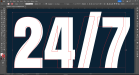
I'm having a heck of a time trying to match up the two sans serif typefaces used in the attached image. None of the online font ID services are providing any accurate hits. They're not any condensed/compressed version of Helvetica, Franklin Gothic, Impact or Haettenschweiler. I suspect they could be from Google Fonts' web site or another free-ish fonts source. The proportions of the lettering look mostly normal, so if any artificial squeezing/stretching has happened it's probably minimal. Thank in advance for any help.
 

Attachments

  • 24-7-ServiceSampleLetters.png
    24-7-ServiceSampleLetters.png
    165.7 KB · Views: 78

Bobby H

Arial Sucks.
Oswald is a match for the "Service" letters. I used the variable version, set the weight at 600 and had to artificially squeeze it slightly. Then it lined up perfectly.

Still trying to figure out the 24/7 letters. I swear I've seen that "7" before; the upper right end is odd looking for how it curves over the corner.
 

Bobby H

Arial Sucks.
Anton Regular is one of the first fonts I pulled up for the 24/7 element. Anton looks like it could be in the same type family as those 24/7 numerals, but only if Anton had more styles than just the Regular weight. This one just doesn't line up, not even when distorting it. At any rate, I ended up just manually re-building the numerals. Still, it would be interesting to know what they used.
 

Attachments

  • Anton-247-Close-ish.png
    Anton-247-Close-ish.png
    270.8 KB · Views: 43

JK Morgan

New Member
Looks like Acumin Variable Concept . Weight 867 Width 97

Jill
PS. Actual weight might be a little less, but close.
 
Top