• I want to thank all the members that have upgraded your accounts. I truly appreciate your support of the site monetarily. Supporting the site keeps this site up and running as a lot of work daily goes on behind the scenes. Click to Support Signs101 ...

Gilding: NEWBIE

mesheau

New Member
Hey Guys/Gals

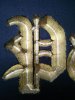
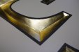
Started to practice some gildings on an old sign blank we had kicking around the shop. The letters are V-carved and the material is HDU.

I've primed, painted the surface as well as using 1 shot gold on the letters behind the gold leaf. Question is the gold leaf is going down horribly.

I believe it may be from not sanding inside the letters enough. Right now I'm not really liking the HDU, doesn't seem that durable, dents and chips very easily.

Can any give some input? (don't laugh, I know it looks like garbage)

Thanks
 

Attachments

  • CAM01476.jpg
    CAM01476.jpg
    71.9 KB · Views: 201

Jillbeans

New Member
Heck, that looks really bizarre. What kind of primer?
Did you use metallic or imitation gold 1 Shot?
What kind of size are you using? Which type of gold leaf?
Love....Jill
 

mesheau

New Member
Heck, that looks really bizarre. What kind of primer?
Did you use metallic or imitation gold 1 Shot?
What kind of size are you using? Which type of gold leaf?
Love....Jill


Using BM Fresh Start primer, BM Black Latex Exterior Paint, 1 Shot Imitation Metallic Gold, Rolco Quick Dry Size, and Giusto Manetti 24k Gold Leaf (Beating).

So I get the sizing down, let it tac up for about 2 hours, then take the forms of leaf and push them into the letters until evenly coated. Maybe my process is wrong?

The only thing I can think of is the HDU wasn't sanded enough. I got the size on really well with straight crisp lines, however because the surface was a bit rough I think it bled out around the edges.
 

letterman7

New Member
I'm not a big fan of latex on dimensional stuff like that. It's too thick for my tastes. But yes, sand the HDU down a bit (get rid of the milling marks), and put a couple coats of good quality enamel on it until it's smooth(er). Then use your size - up to you as to quick or slow. I'm finding that even Rolco's slow size is setting up far quicker than in days past, but either one you use you still need to wait for the 'whistle tack' set up - where your knuckle just drags on the sizing. Then put your gold down. 99% of the time I use the patent gold leaf and brush the dregs into the crevices with a badger hair brush. You're almost there, just pay attention to your coverage on the edges with the sizing.
 

Jean Shimp

New Member
Some brands of 15 lb.HDU are very porous and will not give you a crisp edge on a V carve letter. The gold will pick up all the roughness on the surface it is applied to. Latex is soft paint and not really sandable unless it has cured over 30 days. If you want a smooth surface, prime with a thick bodied primer, then sand, then paint with 1 shot, then put on your size. Be careful that the size doesn't "pool" in the V gulley. I use loose leaf for guilding.
 

Jillbeans

New Member
Great advice. I don't gild a lot, but for that I would probably go with loose leaf.
Your background looks really rough textured to me.
 

TammieH

New Member
Its all in the prep, sand the HDU smooth, nice coats of primer, sand, then paint, sand again if needed and paint...no to latex or acrylic unless you spray.
 

Billct2

Active Member
Also looks like the size (or maybe it's the paint) is puddling in the bottom of the letter.
This can result in several problems, uneven drying, cracking etc. Also looks like the size may have been too dry
on the sides of the letter. What everyone else said about prep is key with gold leaf. I like the surface to be smooth
and the finish as though it weren't being sized.
 

round man

New Member
Gold leaf reflects whatever texture it is gilded to,...if it's gilded on glass properly it will reflect light just like a mirror because the surface texture of the glass is so smooth slick and even,.....i've tried to gild sandblasted glass due to a client's odd request and it ended up looking like gold spray paint on a sidewalk due to the texture,...most beautiful high burnished gilded carved lettering is the result of putting the size down on a super smooth,prepared surface that allows the gold to reflect the smoothness of the surface it is gilded on,.....


edited to add,...most novices will try to put the gold on size that has not fully cured thus "drowning" the gold by letting the reflective quality sink into the wet skin of the size,....size should be tacked well enough to "squeak" when brushed with your knuckle without leaving any marks in it,...this is most easily done by putting down a "test" spot on a scrap of the substrate you intend to gild so you don't mess up your project when you test it, if you test too early
 

Stanton

New Member
What everyone else said.

Plus... mix a tiny dollop of yellow oil paint into the size.
Makes it a bit easier to see how the size is covering.
 

signcrafters

New Member
I'm sure others will disagree, but I always paint letters black NOT gold.
The black shows holidays better- I don't want to hide my mistakes, I want to fix them.
Also, I use LeFranc Charbonnel
slow size- gives me the best result.
Don't push the gold into the size, let it sit on top and lightly mop excess.

Good Luck!
 

signmeup

New Member
Here is the only close up I could find of my gilding. I use Duna's Corafoam 15 pound HDU. I was using some other stuff but found it too coarse to get a good looking surface. These letters were hand carved so they were very smooth to start with. I sanded them lightly with 320 grit then primed them... 2 coats sanded in between with more 320. You don't want to make them too perfect or they won't look hand did and they won't sparkle. (your routed letters look like the bit was going too fast or was dull. I'm also a bit suspicious of your spindle bearings.)

The primer I use is Home Hardware 8010 latex. It's made for priming plastic siding and galvanized metal. It's only sold in Canada but you should be able to find something like it. It sands like automotive lacquer primer... that is to say very, very well. Once the primer is done I give the letters a coat of flat mustard coloured latex paint that has had most of the water evaporated away. It's like mud almost. Thick as cold-cream. I like the brush marks... you can tell a human did it. I give that a quick sand with 320 grit too. Now it's ready to gild.

I use Rolco size. I found it works better than One Shot. Better to work with and the final gild is far more durable. Anyway... one thick coat of size, but not so thick it puddles and wait an hour and a half or so. Test for tac. I do a test patch for this. If you drag a finger across it and it goes dull it's not ready. I don't bother with the whistle method. You can gild the Rolco quite early and still get good results. Just make sure that when it's lightly touched, the finger print goes completely away. If it does you are golden.

I also found "thicker" gold works better for me. I use "double thick 24K" from Wrights of Lymm in the UK. Use loose gold for lettering. Patent leaf is for out doors. It's a real pain to do letters with patent leaf.. it'll take you forever. Horrible stuff.

Adrian
 

Attachments

  • 007sm.jpg
    007sm.jpg
    52 KB · Views: 248

Kottwitz-Graphics

New Member
What everyone else said.

Plus... mix a tiny dollop of yellow oil paint into the size.
Makes it a bit easier to see how the size is covering.

No, no, no, no... If you add paint to the size, you are changing the chemistry of it, thus changing how it reacts. The ideal thing to use is Kaolin USP. Just dust it on, and vacuum the excess off. (This prevents the gold from sticking to what you don't want it to.) Then you apply the size, which appears as if you are painting gloss. Allow it to dry to the correct tack, then apply the gold leaf. This is what I learned from Francis at Signs of Gold, and I saw it in action.
 

Gino

Premium Subscriber
No, no, no, no... If you add paint to the size, you are changing the chemistry of it, thus changing how it reacts. The ideal thing to use is Kaolin USP. Just dust it on, and vacuum the excess off. (This prevents the gold from sticking to what you don't want it to.) Then you apply the size, which appears as if you are painting gloss. Allow it to dry to the correct tack, then apply the gold leaf. This is what I learned from Francis at Signs of Gold, and I saw it in action.


Same here..... the paint technique is kinda bad. It works, but not very well. I did it years ago, until I was taught different by one of my employees. He was a true master in gilding. He's not dead, just long time retired. The powder technique is practically fool-proof. We use slo-size. It always seems to give far more brillance and last far longer outdoors. It's also easier to control if you're doing a lot of gilding with a longer window of time.

I get what ya mean about painting letters black, but almost all of our gilding is done on very dark colors, thus the color is already very dark and eliminates the holiday hiding feature as you mentioned.
 

Billct2

Active Member
I use a red underpaint seems to give the gold a nice glow.
And I use the dreaded drop of yellow in the size.
I've also started laying the leaf a littl;e soomer than I used to,
if the gold is too "mirror" it makes it real hard to read.
 

signmeup

New Member
Forgot to mention... I carve my lettering through a paintmask so powder is not required. Red iron oxide is a traditional base coat colour for gilding. More typical indoor of work though.
 

Stanton

New Member
No, no, no, no... If you add paint to the size, you are changing the chemistry of it,

No, not really. Just give it a tinge of off-clear. Might as well be off towards yellow.
Could use any color to contrast with or differentiate from the BG.

It is not about the color, it is about seeing where you have applied size.

Yellow is what sign artists use because it is traditional.
 

Gino

Premium Subscriber
No, not really. Just give it a tinge of off-clear. Might as well be off towards yellow.
Could use any color to contrast with or differentiate from the BG.

It is not about the color, it is about seeing where you have applied size.

Yellow is what sign artists use because it is traditional.


Ya know what.... to use your phrasing, I'll be the first to call BullScat on your lame theory. Wherein it does work to an extent, it is not at all recommended by anyone who gilds for a living. I presume you just heard your theory through the grapevine of a buncha hacks.

Tell me how, when and where you would use your drops of paint [what kinda paint we talkin' here ??] to your size. The thread is all about gilding and gold leaf, so I'm not stepping on anyone's toes asking you, point blank, what you're talkin' about.
 
Top