• I want to thank all the members that have upgraded your accounts. I truly appreciate your support of the site monetarily. Supporting the site keeps this site up and running as a lot of work daily goes on behind the scenes. Click to Support Signs101 ...

Less is more wrap

Flame

New Member
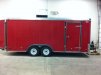
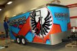
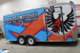
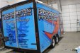
I tried telling myself...less is more. I want clean, I want simple, but something that pops. So, this is how it turned out. You can let me know if I achieved it or not. Had little over 1 week to design, get it approved, print and install. Started off as a red trailer as you can see in the pics...
 

Attachments

  • phoenix1.jpg
    phoenix1.jpg
    45.7 KB · Views: 122
  • phoenix2.jpg
    phoenix2.jpg
    68.2 KB · Views: 82
  • phoenix3.jpg
    phoenix3.jpg
    63.9 KB · Views: 76
  • phoenix4.jpg
    phoenix4.jpg
    67.1 KB · Views: 77

SignManiac

New Member
You definitely got the pop. I like it except...The font for the name is just a little bit hard to read at first glance. Still great job!
 

Flame

New Member
You definitely got the pop. I like it except...The font for the name is just a little bit hard to read at first glance. Still great job!

Did struggle with that a little, and wasn't sure about using white on the circle when there was really no white anywhere else...but owner insisted on keeping them consistent because there will be a booth all around the trailer and those are the colors and logo's used. So did my best :)
 

ForgeInc

New Member
I like it.

Agree about the font, not really a fan. A few other nitpicky things...don't really like how the head of the eagle is cut off and boy, could ya make that TM bigger next time?

; )

Otherwise good job though, especially matching of the corners.
 

Flame

New Member
I like it.

Agree about the font, not really a fan. A few other nitpicky things...don't really like how the head of the eagle is cut off and boy, could ya make that TM bigger next time?

; )

Otherwise good job though, especially matching of the corners.

lol TM had to stay, couldn't tweak the logo or circle other than outlines/drop shadows. I do agree with you 100% though.

I have an idea on a fix for the bird so his face shows again. Will have to do it when they're back in town as I was in a huge time crunch and wasn't done at my shop.

Actually just FYI, I didn't even do a site inspection/measurements. Customer supplied 3 pics and a dozen measurements. Just too short on time to do otherwise so I'm happy that everything lined up as well as it did!
 

signswi

New Member
I also have some reservations about the font but overall it's great. Better than most in that market which tends to be grunged up so bad it's impossible to tell what's going on.
 
Top