phototec
New Member
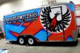
Flame,
I like the overall design, I think more wraps should be simple and clean like what you did, not all gaudy using every effect that Aurora Graphics sells.
However I have to agree the placement of the birds head is pretty bad and sticks out like a sore thumb to me. The bird image should have been moved so it would NOT be obstructed by the door frame (see my comp below).
It is so VERY important when creating a design around trailer doors (window), you do your homework and make a very accurate template, so placement of critical design elements are NOT obstructed by door frames, hinges etc.
I make my own measurements and use the best tool available, my digital camera. I shoot the sides, front and back using a 85-100mm lens, centered between the left and right and top to bottom to eliminate lens distortion. Then import that image into my design software at scale on a separate layer and use it for verification that no major design elements are going to be obstructed by things like door frames (window frames), etc.
Overall you did a great job.