-
I want to thank all the members that have upgraded your accounts. I truly appreciate your support of the site monetarily. Supporting the site keeps this site up and running as a lot of work daily goes on behind the scenes. Click to Support Signs101 ...
You are using an out of date browser. It may not display this or other websites correctly.
You should upgrade or use an alternative browser.
You should upgrade or use an alternative browser.
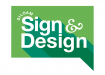
Logo…thoughts please!
- Thread starter jchristians
- Start date
Gino
Premium Subscriber
Needs some tweaking.
For my old eyes, that kinda perspective looks like an attempt at some form of shadowing, but isn't cutting it. Therefore, it must be following the bottom jut-out.
The overall look reminds me of the old comic books where people said something in a bubble.
I'm not terribly liking the word floating up there, either.
The colors are a little too subdued.... almost too easy on the eyes, therefore not memorable.

theprintlabtx
New Member
The "Siloam" looks like it was forced onto the text of a tutorial piece to me. Personally I would do away with the overlapping shadow, I think one solid shadow would look more appealing. Also I think the shadow would feel less awkward if it was a darker shade of the background rather than a completely different shade of green.
I also would consider how this is going to look in black and white, I have a feeling it's not going to look great.
Why did you choose "Signs & Design" to be the headliner of this logo. IMO the Siloam should be the largest font if not equal to the rest. It communicates "Generic sign and design company with little creativity" to me. I don't want to sound harsh, it's just honesty. I feel like I grow in the most in my craft when people are honest, so it's not from a hateful place.
Marlene
New Member
I really like the idea of this. maybe try the lighter shadow in the top letters and the darker on the bottom so you have the two colors blended a little better. the name does look forced on. can you put it into a semi-circle and have it look like a highlight? I'd try a few things as it is almost there but just needs a little tweaking
shoresigns
New Member
The "Siloam" looks like it was forced onto the text of a tutorial piece to me. Personally I would do away with the overlapping shadow, I think one solid shadow would look more appealing. Also I think the shadow would feel less awkward if it was a darker shade of the background rather than a completely different shade of green.
I also would consider how this is going to look in black and white, I have a feeling it's not going to look great.
Why did you choose "Signs & Design" to be the headliner of this logo. IMO the Siloam should be the largest font if not equal to the rest. It communicates "Generic sign and design company with little creativity" to me. I don't want to sound harsh, it's just honesty. I feel like I grow in the most in my craft when people are honest, so it's not from a hateful place.
Agreed. Your name is "Siloam", not "Signs & Design".
It has a very 1975-1978ish look to it, which if that's your intention, you're on the right track. The others observations about the shadowing were felt here too. The shadowing doesn't make sense and has no relationship to the letters its trying to or should be shadowing. Either do sign with one green or do design with another green, but the jumbled thing that doesn't create the illusion of a shadow or depth of filed doesn't work.
I also have trouble with the equal weight given to "sign and design" Its too repetitive and lacks prioritization. Which is it, you do 70% signs and 30% design, or vice versa? If its truly 50/50%, then maybe you can divide the two with a font, stroke weight or color change.
I also have trouble with the equal weight given to "sign and design" Its too repetitive and lacks prioritization. Which is it, you do 70% signs and 30% design, or vice versa? If its truly 50/50%, then maybe you can divide the two with a font, stroke weight or color change.
jchristians
New Member
Thanks everyone for your feedback! Much appreciated!
Yes, it has a 70's - ish era feel to it with the shadowing.
I was going with the speech bubble idea with the "background", get it, sign, design, communicating harr harr.
Siloam is the name of the town, so, I feel like it needs less priority, Sign and Design is what I do (or will do)") I think it is needed in a small town startup to say what you are/do in your name…so, I did.
I think it is needed in a small town startup to say what you are/do in your name…so, I did.
I will look through comments and make adjustments and hopefully get more feedback from you all. I don't get my feelings hurt, so fire away! Thanks!
Yes, it has a 70's - ish era feel to it with the shadowing.
I was going with the speech bubble idea with the "background", get it, sign, design, communicating harr harr.
Siloam is the name of the town, so, I feel like it needs less priority, Sign and Design is what I do (or will do)
I think it is needed in a small town startup to say what you are/do in your name…so, I did. I will look through comments and make adjustments and hopefully get more feedback from you all. I don't get my feelings hurt, so fire away! Thanks!
HDvinyl
Trump 2020
Wouldn't an oval be more appropriate?I was going with the speech bubble idea with the "background", get it, sign, design, communicating harr harr
Attachments

Gino
Premium Subscriber
Wouldn't an oval be more appropriate?
No, not at all. Now it looks like a bubble with a d!ck and the green areas mean even less.

Gino
Premium Subscriber
I hope that's not what you know as a d!ck.
No, my first inclination is a slow bartender, who gets upset, when the patrons hafta start pounding the glass on the bar. That picture by you, was second. :ROFLMAO: Same dog, different spots.
jchristians
New Member
Wouldn't an oval be more appropriate?
Not a huge fan of the oval speech bubble.
Here is my most recent update.
Seemed like the majority of you didn't like the word "Siloam" curving around the S in original logo I attached. Thanks!
Attachments

jchristians
New Member
Playing with another rendition of this concept.
Ouch! That one really hurts.
I can see a rough, hand hewn, carved looking shape being cool, but yours doesn't have enough "cuts" or the right fonts to pull it off realistically.
I'd round the corners on the rectangular caption bubble. Do you understand the analysis a few of us have made of the shadowing you've done? I'll try to illustrate the issues, but I'm right in the middle of something i have to get done.
jchristians
New Member
Do you understand the analysis a few of us have made of the shadowing you've done? I'll try to illustrate the issues, but I'm right in the middle of something i have to get done.
Yeah, shadowing…some of you have mentioned you think that each word needs to have its own shadowing…"Sign" with darker green and then "Design" lighter. I will play with shadowing when I have time. Thanks!