• I want to thank all the members that have upgraded your accounts. I truly appreciate your support of the site monetarily. Supporting the site keeps this site up and running as a lot of work daily goes on behind the scenes. Click to Support Signs101 ...

Logo…thoughts please!

Gino

Premium Subscriber
Here's a thought. Leave the box, bubble whatever that thing is around your name off for the time being. None of them are working.... anyway, not to your advantage.

Get your name to at least stand on it's own, then think of some sort of cute outlines for it. Otherwise, we're just all trying to design a sign..... not a branding/logo. :rolleyes:
 

jchristians

New Member
More, More & More. Simplified.
 

Attachments

  • logo2.png
    logo2.png
    25.1 KB · Views: 85
  • logo3.png
    logo3.png
    26.4 KB · Views: 103
  • logo4.png
    logo4.png
    27.3 KB · Views: 114
  • logo5.png
    logo5.png
    27.1 KB · Views: 98

Gino

Premium Subscriber
Yeah, let's keep it simple.

First one is the winner !!!!!!!


:thumb: Okay, let's get back to our regular programming, now.​
 

Gino

Premium Subscriber
Not me. Stick with the other one and we can chalk this up and go for a drink, later.:beer:beer
:awesome:
 

jchristians

New Member
Cool. It always amazes me how as designers we start so complex in our designs and end up pulling way back to its simplest form.
 

oksigns

New Member
I'm going to suggest you work at it some more. "Siloam" still appears forced in the first iteration. The "black & white" version does not offer anything unique to your name or brand. It comes off extremely generic. You make the signs and design is implied, so sell the name. Siloam. The concept appears to be a speech bubble to represent the crafted message, right? Your name is the dominate element here. Don't kid yourself- anyone can be yadda yadda "signs" or yadda yadda "sign & designs". Play with it in black and white first, and try to stay away from trendy effects- you don't want to date yourself and look out of place all of sudden.
 

Rick

Certified Enneadecagon Designer
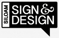
Except for your "Siloam" I thought your original showed more promise.

I know this looks 70's, but to me, it looks like "International Typographic Style"
or "Swiss".

https://www.google.com/search?q=Int...ional+typographic+style+grid&revid=1987944209
https://www.google.com/search?q=Int...graphic+style+graphic+design&revid=1987944209

Starting around the 40's to the 60's. Near the end of that style, the
magazine that championed the 70's version of Swiss was Avant Garde... the
original typeface came from the design of the magazine which was used and
abused way too much.

There are a few books, most rare. Books by Yasaburo Kuwayama catalogued many
of the logo's of that era.
http://www.amazon.com/s/ref=dp_byli...oks&text=Yasaburo+Kuwayama&sort=relevancerank

I think the king of modern swiss is: http://blog.iso50.com/category/iso50/

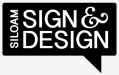
My opinion is: The logo should be able to stand alone (no elongated drop
shadows or enclosure) and then be able to be used in various formats.
This may look to "plain wrap ( http://hollywood2020.blogs.com/photos/celebrities/joyce_plain_wrap_photo.jpg )" without the fluff so you may have to play
with the type some more.

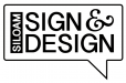
Look at the images below, the logo has that shadow, and can
stand alone. I'm not a huge fan of the actual logo, but like how
they integrated it into the marketing and wall graphics.

The color and the colors of the drop shadows are odd.

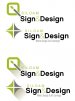
Why stop at this one idea, do you have anymore ideas?

The last ones are awkward... I don't know how long you have been a designer
and if you went to school, but the last ones are not showing the experience you
seem to have.

I would polish up your original idea, then I would research and try
a few ideas.. not just the one
 

Attachments

  • 59b7820ad926671497f5cbc7e9bcf388.jpeg
    59b7820ad926671497f5cbc7e9bcf388.jpeg
    176 KB · Views: 113
  • 9af85a9da1c122a2f4f2f044fcd60415.JPG
    9af85a9da1c122a2f4f2f044fcd60415.JPG
    25.4 KB · Views: 109
  • 9151c3acad9b2ebb813925a0c90330b3.jpg
    9151c3acad9b2ebb813925a0c90330b3.jpg
    34.9 KB · Views: 108
  • a20c61f457e9c7641044cebdd25ac292.JPG
    a20c61f457e9c7641044cebdd25ac292.JPG
    49.3 KB · Views: 92
  • 3d760423b494bcd3afbe6dbfe5aaf0df.JPG
    3d760423b494bcd3afbe6dbfe5aaf0df.JPG
    66.8 KB · Views: 98

Rick

Certified Enneadecagon Designer
Not the answer but exploring and researching various ideas...

Looking at examples, I toned down the shadow, allowing
the logo to stand alone and give it the option to add effects
and attempting to make it iconic and memorable.
 

Attachments

  • siloam-2.jpg
    siloam-2.jpg
    110.1 KB · Views: 88

Jillbeans

New Member
This "return to the 70s" stuff jars me, because it reminds me of how old I am.
But it was a clean, dynamic style for the most part, and deserves to be revisited.
Your original concept was OK, I didn't like the name, just like everyone else.
Your stripped down version was OK too, but lacked the feel of the initial attempt.
I'd revisit the original, maybe play with the ampersand location, and re-think where and how you put the name. No oval.
Love....Jill
 

Marlene

New Member
This "return to the 70s" stuff jars me, because it reminds me of how old I am.
But it was a clean, dynamic style for the most part, and deserves to be revisited.
Your original concept was OK, I didn't like the name, just like everyone else.
Your stripped down version was OK too, but lacked the feel of the initial attempt.
I'd revisit the original, maybe play with the ampersand location, and re-think where and how you put the name. No oval.
Love....Jill

agree with Jill. the first attempt wasn't all that bad and only needed some tweaks.
 

Tiki

Font Sage
Maybe rotate it a little with a little bolder looking typeface
 

Attachments

  • Siloan.jpg
    Siloan.jpg
    63.1 KB · Views: 93

Jillbeans

New Member
Good thinking!
I like any of those, I love putting the name in the bubble because it looks like people are talking about the company.
 

jchristians

New Member
Latest on the logo. A lot more versatile than first concept. Made a couple ideas for the speech bubble "mark". Using the S & D in both. Layout with all those words is a challenge. Thoughts? Thanks!
 

Attachments

  • Logo1.png
    Logo1.png
    21.2 KB · Views: 99
  • Logo2.png
    Logo2.png
    24 KB · Views: 117
  • Logo3.png
    Logo3.png
    21 KB · Views: 107
  • Logo4.png
    Logo4.png
    11.7 KB · Views: 99
Top