• I want to thank all the members that have upgraded your accounts. I truly appreciate your support of the site monetarily. Supporting the site keeps this site up and running as a lot of work daily goes on behind the scenes. Click to Support Signs101 ...

Logo I did...

ProWraps

New Member
i am not a logo designer.i did this after way too much beer and what nots and what have yous.


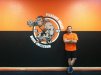
this is my buddy that opened a wrestling room for youth. he is the one in the picture.


did three of these in his wrrrrrasstlin room for him.

feel free to tear it a new pooper hole. it was free fifty so i dont care. i actually enjoy it.
 

Attachments

  • pvwr.jpg
    pvwr.jpg
    47.8 KB · Views: 134

Ragin Cajun

New Member
Nice..but I am new and have a question.

I see how you made the type follow the circle which cause the bottom type to be upside down.

I understand your point...is this the general way to do it...or would you flip the type?

I understand it is a personal preference...but...what is most common way of doing this?

Thanks!
 

Moze

Active Member
I think it's pretty cool - nice job!

The only thing that seems a little off is the dude's left leg (his left) seems like it should be behind the white border....almost like he's stepping out of the circle. ?

Also, I kind of agree on maybe the bottom text should be flipped.

But ya, I like it!
 

tattoo.dan

New Member
looks sweet. but i would have flipped they bottom text. I fell outta my chair trying to read around the circle....or that could have been the beers fault...
 

ProWraps

New Member
yeah it was beer and crappy illustrator fit text to path.

i just didnt really care.

again, free fifty.
 

ProWraps

New Member
oh btw, that orange in the logo, is not the paint on the walls.

it was a SICK drunk crown royal PMS home depot color match i did. took me like entire minutes to do.

and suprisingly it doesnt match. i know i know. its hard to believe.
 

GAC05

Quit buggin' me
Having the lower text that way makes sense,
it would read correctly if you are trapped on the mat in a leg triangle trying not to pass out or have your face pressed any farther into the other guy's nuts....


wayne k
guam usa
 

ProWraps

New Member
Having the lower text that way makes sense,
it would read correctly if you are trapped on the mat in a leg triangle trying not to pass out or have your face pressed any farther into the other guy's nuts....


wayne k
guam usa


i told him his tagline should be:

"Nuts to Butts".

he didnt agree. he was to busy man hugging another dude while they were both on their knees about to engage in sweaty man combat.

oh well. i tryed :help
 

SignManiac

New Member
Not bad for someone who doesn't design logos for a living :thumb:

Has a nice retro feel going on. You might have a future in branding if the wrap business ever falters :)
 

Gino

Premium Subscriber
I don't care how good or bad the logo is..... I'm just proud of the state of mind you were in when doing it................ :toasting:
 

ProWraps

New Member
I don't care how good or bad the logo is..... I'm just proud of the state of mind you were in when doing it................ :toasting:

well christ. i can drink to that!

thanks for the kind words all.

best polished turd eva!
 
Top