• I want to thank all the members that have upgraded your accounts. I truly appreciate your support of the site monetarily. Supporting the site keeps this site up and running as a lot of work daily goes on behind the scenes. Click to Support Signs101 ...

My website is now more or less funtional. What do you think?

signmeup

New Member
looks great, but 2 things I noticed. On the other pages, there i no way to get back to the home page, and there is no phone number to contact you.
I've been wondering if I needed a home button. The entire header is a home button but I didn't label it. I'll add the phone number. Thanks for posting.
 

Rick

Certified Enneadecagon Designer
Not that this is the answer but....

It's kinda hard to take a "template" look out of most templates... nothing horrible about having a template, your not selling web design, but you want to take the look out as much as possible. You also want to brand and identify with a logo, and a layout that goes with a concept, to me your concept is traditional, craftsman type of signs...
 

Attachments

  • SHOWPEICE CRAFT copy.jpg
    SHOWPEICE CRAFT copy.jpg
    255.6 KB · Views: 68
Last edited:

signmeup

New Member
Thank you very much for going to that much trouble Rick. I really like what you've done. The colours are great. I'm still trying to think up an idea for a logo....but you're definitely right...I need one.

I'm afraid I don't know enough about websites to be able to see if it's made from a template or scratch though. I'll have to try looking for some design tutorials I guess. Do you just make a page in illustrator or Corel and then make that into a web page by cutting it up?
 

Craig Sjoquist

New Member
Well not impressed with website .. but very impressed with your work

It is easy to see, loads up quick, few words, good points indeed.. but no excitement to keep ya there and buy ... but surely this will improve with work like yours the rest will follow
 

SignManiac

New Member
I didn't look at any templates as I didn't want to be influenced by them. As Rick pointed out they all tend to have the same feel to them.

I started from scratch in CorelDraw designing mine and then had a web guy I know make it work off of my exact design and concept. I think your site needs to reflect the artistic side of your work. Here's what mine ended up looking like.

http://www.skywatchsigns.com/new%20skywatch/index.html
 

luggnut

New Member
signmaniac your portfolio makes me drool..... i am so jealous. one day i hope to be doing work like that!!!!
 

artsnletters

New Member
i think you have to have a logo....I echo what Rick said. I think the website looks nice, just a little "template-ish". Your logo sets the tone for the quality of the work you want to produce.
Tim
 

Dan Antonelli

New Member
Beautiful work for sure. Wish the web site spoke to me on that level, however. I could be biased (ya think! lol) but I tend to think someone selling such a high end, custom product should also have that for their site as well.

Also, no SEO to speak of as someone already indicated I think.

This is an older site for us, but I still like the colors and custom attributes of it. http://www.customcarvedsigns.com/
 

Lau Designs

New Member
I must agree with the others that your site needs to loose that generic template feel. But what you have works much better than many other sites that have poored in technology known to man. Sometimes less is more, The site defintely needs a little more personality.
I found what looks to be a cool piece of software that may be able let you be creative and give it that certian feel without trying to learn all of the web technologies out there. I stumbled upon this because I wanted to create a site with more creative control. The name of the software is site grinder and I believe they have a free trial also. It's not the cheapest software out there but looks like it's worth the money. It allows you to develop your site in Photoshop. So if you have a good grasp on Photoshop it just may be what you need to create the site you want. I can't speak from experiance but it looks good.
 

Marlene

New Member
well at first sight, I liked it a lot as it was simple yet got the message of the hand done work out and you backed the copy with samples to show that you do what you say. once I started reading what others had to say, I can see that you might want to have a little more fancy style page that fits your talents better as Dan suggested. but if you do nothing but run with what you have, your work is so great that it may not need anything else. I am torn over liking it as is or going with the others who think it needs more.
 

artist4christ

New Member
Thanks for taking the time to make your post. Some good suggestions there. I don't really know much about meta tags but I'll click the Xara help files and see what they say. I'm afraid I don't know what "captcha" is.

Captcha is the image that you see with all the goofy letters that you are required to type in to get the form to post. It is a protection method used to avoid spam to you and avoid allowing bots to use your form to send spam.

Meta is not as important as people think you need to have the basics, title, description and a few other things. SEO is not based on meta tags like it used to be, the content drives SEO as well as a few other things. Alt tages for images things like that.

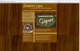
Rick, thanks for posting. I wonder if you could give me some direction or a link to a site that has the "crafty" look you mention. How did you know it started as a template? And how can I fix that? I'm afraid you may have to talk down to me a bit..... you're quite a few levels above my abilities.:notworthy:

Templated feels are almost inpossible to avoid using some sort of software, but for those learning those sorts of software can get you to a point in which you don't need them anymore. It's a good start in an ever changing enviroment.

I've been wondering if I needed a home button. The entire header is a home button but I didn't label it. I'll add the phone number. Thanks for posting.

Most web broswers are accustom to knowing that he header is generally a clickable link back to the site. You can always add a home button, but its been proven by many click through studies that most people see it as a default.

Not that this is the answer but....

It's kinda hard to take a "template" look out of most templates... nothing horrible about having a template, your not selling web design, but you want to take the look out as much as possible. You also want to brand and identify with a logo, and a layout that goes with a concept, to me your concept is traditional, craftsman type of signs...

He may not be selling web design, but a good or bad website will drive customers away or bring them in. In the realm of e-commerce a poorly designed site no matter how secure appears insecure to most users.

That can be translated into well they don't take the time to either hire a professional or don't care, and that can drive customers away as well.

Beautiful work for sure. Wish the web site spoke to me on that level, however. I could be biased (ya think! lol) but I tend to think someone selling such a high end, custom product should also have that for their site as well.

Also, no SEO to speak of as someone already indicated I think.

This is an older site for us, but I still like the colors and custom attributes of it. http://www.customcarvedsigns.com/

I agree, but you preach SEO yet the website you presented is full of flash, which is counter productive to SEO. Flash content is bypassed when engines cache your site and you haven't provided non flash enabled alternative.

SEO in the recent years has taken a totally different turn as to how search engines use the information, along with those methods come black hat and white hat SEO. So its recommended that SEO be done by someone that has a good understanding.

Starting with simepl things like a meta description and title will help, and providing alt tages for images. Outside of that SEO is content driven.

I agree with the high end product should be matched with a high end website.
 

Dan Antonelli

New Member
I agree, but you preach SEO yet the website you presented is full of flash, which is counter productive to SEO. Flash content is bypassed when engines cache your site and you haven't provided non flash enabled alternative.

SEO in the recent years has taken a totally different turn as to how search engines use the information, along with those methods come black hat and white hat SEO. So its recommended that SEO be done by someone that has a good understanding.

Starting with simepl things like a meta description and title will help, and providing alt tages for images. Outside of that SEO is content driven.
.

Funny you had picked that site as not a good example of good SEO. Google 'custom carved signs', and tell me who is first.

If you'd like more examples of our SEO successes, click here: http://www.signshopmarketing.com/seo_rankings.htm

or for non-sign industry specific sites:
http://graphicd-signs.com/html/port_seo_successes.htm

We've been doing this a very very long time and after 300+ web site, we know a thing or two. I think our successes on those pages speak for themselves.

I'm not saying your wrong about Flash, but you are wrong about sites that use only a component of flash. Yes, flash based sites are generally poor for SEO - which is why we don't do them.
 

artist4christ

New Member
Funny you had picked that site as not a good example of good SEO. Google 'custom carved signs', and tell me who is first.

If you'd like more examples of our SEO successes, click here: http://www.signshopmarketing.com/seo_rankings.htm

or for non-sign industry specific sites:
http://graphicd-signs.com/html/port_seo_successes.htm

We've been doing this a very very long time and after 300+ web site, we know a thing or two. I think our successes on those pages speak for themselves.

I'm not saying your wrong about Flash, but you are wrong about sites that use only a component of flash. Yes, flash based sites are generally poor for SEO - which is why we don't do them.

Never said that it was a bad example I said that you failed to address those issues with flash components. Your response reflects the point I made.

I to have been in the game for a while as well, and you're correct your successes are great. There is no taking away from that. Just stating my perspective on the issues and advice given in this thread.
 

signmeup

New Member
Wow! That's a lot of posts to digest. Thanks all. I'm doing my months end book work that I shudda had done 2 days ago so I can't respond to much of this yet. But I do appreciate the posts. I'll get to it tonight.
 

signmeup

New Member
OK....here's a re-work based on the feed back I recieved from this thread.

http://www.showpiecesigns.com/index.htm

The site still needs SEO stuff but I thought I would work on the look first before I tried to get a lot of people to find it. One step at a time. The nav bar buttons are a little screwy but I'll fix that when I get some more time to work on the site. ( I had a heck-of- a-time getting the site re-loaded and I'm "fatigued")
So....what do you guys think of the re-do? Does it look less template-like? There's really nothing left of the template but it could still look like a temple I suppose.

Oh yeah...I still need a footer with some stuff on it.....
 
Top