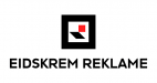
• I want to thank all the members that have upgraded your accounts. I truly appreciate your support of the site monetarily. Supporting the site keeps this site up and running as a lot of work daily goes on behind the scenes. Click to Support Signs101 ...

New logo before moving

BlueSpot

New Member
Hi :smile:

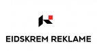
We move to a new building in August.
On this occasion we designing a new logo.


This is the logo we've designed, but before we start using it, we need feedback.


What do you think?


PS. "REKLAME" is norwegian for advertising.


Vegard, Norway.
 

Attachments

  • logo_hoyrestilt.png
    logo_hoyrestilt.png
    32 KB · Views: 168
  • logo_5_midtstilt.png
    logo_5_midtstilt.png
    10.6 KB · Views: 130
  • skjermbilde_2015-05-21_kl._15.29.jpg
    skjermbilde_2015-05-21_kl._15.29.jpg
    105.8 KB · Views: 164

Gino

Premium Subscriber
That wall or floor simulation looks fantastic, but you sure have a lot of spelling errors.......... :rolleyes:


When using the black border, the border is a little overbearing/overpowering.... I'd kick it down a notch.​
 

BlueSpot

New Member
That wall or floor simulation looks fantastic, but you sure have a lot of spelling errors.......... :rolleyes:

English isn't my native language ;)

When using the black border, the border is a little overbearing/overpowering.... I'd kick it down a notch.

Actually we tried that, but we didn't like it, the thickness of the border is the same as the square and slash.

We whant the logo to be strong and "hard" for the eyes and we whant it to hit our costumers in the face and say "here are we"! :)
 

TammieH

New Member
you probably already thought of this... but...just a thought
 

Attachments

  • eidskrem.jpg
    eidskrem.jpg
    53 KB · Views: 131

BlueSpot

New Member
Yea I understand...it's PERFECT as it is...that's what you wanted to hear, right?

?

I appreciate the criticism, thats what I whant, to hear others opinion.
But does that mean I have to agree to the specific criticism you come with?


We have tried with thinner "border", but we did not like it. Is that wrong?
 

Billct2

Active Member
No, what's wrong is to ask for a critique when you don't want one.
3 of 4 responses were the border, square part of the logo, whatever you want to call, it is heavy.
You're not going to change it or even consider changing it, so why bother?
Happens all the time, design is thrown up for feedback, and the rest of the thread is spent defending the original design.
 

Gino

Premium Subscriber
Ya know.... whether you're from Norway, Greece or Japan....... balance is balance and that box, especially when it's in black is so heavy, it just looks outta whack. Now, perhaps you and your comrades like that for some reason, but is has nothing to do with designs or elements. There are really no reasons to justify it, when it doesn't look good to anyone. If I was looking at an aerial view of a fortress and saw the walls were that thick, I'd be happy, but as for art/composition or creativity, it doesn't work.

As mentioned, when looking for critique and feedback, it's not nice to bite off the heads of the others trying to help you.
Move in, use that thing and be happy. :rock-n-roll:


edit : your English is just fine..... we get the message. You want NO negative input.​
 

Baz

New Member
In my best Schwarzenegger voice ... IT'S NOT A BORDER !

In all honesty, reducing the thickness by 25% would make it much better. It still would have presence without overpowering everything else.
 

oksigns

New Member
Have you explored trying to match the counter and stem to the type of the name. There is already that slanted stem of the "R", which starts to read well for me, but things get a bit disjointed by the time I see the counter and of course the weight of the outside stroke fights with the internals.
 

BlueSpot

New Member
Looks like some people misunderstand me here...I AM happy for the criticism.

Any of you got an account at http://logotournament.com/ ? If so you can find it at the forum there.

90% loves it over there, but that doesn't mean they are right and you guys are wrong.
The thing is, we can't redesign it because of 5 posts, we have to carefully look at constructive criticism of many posts and forums before we decide what to change/fix.
 

boxerbay

New Member
the border is choking the rest. if your keeping it that thick then you need more inner white space. also the slanted leg looks thicker than the head of the R.
 

Gino

Premium Subscriber
Looks like some people misunderstand me here...I AM happy for the criticism.

Any of you got an account at http://logotournament.com/ ? If so you can find it at the forum there.

90% loves it over there, but that doesn't mean they are right and you guys are wrong.
The thing is, we can't redesign it because of 5 posts, we have to carefully look at constructive criticism of many posts and forums before we decide what to change/fix.

Opening the box makes more space.

Better? Any idea is appreciated :)


Honestly, I don't care what you do at this point. Comparing forums is fine and if they all think you're copasetic, then go with it. Why bother listening to anyone here ??

However, you are not fine with criticism, if you say NO to anything and everything anyone here suggests. They were observations on balance among other things mentioned. I wouldn't re-design a thing if you all like it. Just stop telling us you can't change it, then you make those holes in the border. That looks worse than shaving a little off the edge of the border in my opinion. Now your box has two leaks in it.

Bag it for now and come back another day when you're not so irritable. :peace!:
 

SignManiac

New Member
I think it needs to be more trendy. Circle logo's are all the rage today and the font you have is rather plain. It needs something bouncy to express your creative side. You're welcome to use this if you like. Only took me four hours to make. Hope my english is okay.
 

Attachments

  • Lame.jpg
    Lame.jpg
    17.1 KB · Views: 142
Top