• I want to thank all the members that have upgraded your accounts. I truly appreciate your support of the site monetarily. Supporting the site keeps this site up and running as a lot of work daily goes on behind the scenes. Click to Support Signs101 ...

New Logo Critique please

Redwave Signs

New Member
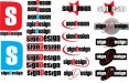
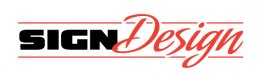
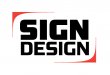
I would like some advice on my logo. I have never had a set logo, but I would like to start the new year off right. I started this as a side business 1.5 years ago and I would eventually like to do this full-time. I am an electrician and I would like to combine my two interests and make a successful business. Most of my work is window advertising, car graphics, banners, various types of signs, business cards. I have a good amount of regular customers. No large organizations, just a lot of mom and pop businesses. I would like to present a professional image. Something clean and easy to reproduce on shirts, business cards etc. I want it clean and to the point. I know there are hundreds of "sign designs" but that is the name I started with and don't really want to change it (and my son loves saying it, he is 4). I like the color combination of red, white, black and silver. Any ideas??? I threw together a few ideas already ... and have a favorite, but want to see what other people think.:thankyou:
 

Attachments

  • SD.jpg
    SD.jpg
    78.7 KB · Views: 202

Artildawn

New Member
Thin red on black will not be legible small or from a distance.
The reversed text, while novel, makes the view work for comprehension.
It took me a second to realize the S in the color block was a D.
Of those presented, I'd lean toward the stuff in bottoms of columns 3 and 4, assuming the red on black color scheme is changed. But to be honest, they all seem a bit plain to me. Sorry, just my opinion.
 

signage

New Member
What you need to do is to design it in black and white then try your color scheme! Black and Red are almost always a NO-NO!
 

astro8

New Member
It took me a second to realize the S in the color block was a D.
I never got that until you pointed it out.

Hate descender lowercase (g) in with same height caps...bad rythem.

Best in there is 3rd column 2&3 up but I'd get rid of the swooshes..I'd start with that as something to work from....(actually very similiar to my own logo).
 

Malkin

New Member
If I had to choose from those presented I would probably focus on the second column, bottom half. I think you could probably come up with better though and may want to continue working up idea's.
 

heyskull

New Member
Who am I to critique?
It took 2 years to do our logo and I hate it now!!!
I personally don't like the name, it makes you sound like all you just do designing of signs.
Am I correct or is it just me!??

Us signmakers are hardest to please especially when it is for ourselves!

SC
 

Redwave Signs

New Member
Thanks to all who provided "USEFUL" input.

I know the name has been overused, maybe I will add something to it.
Colors I am not set on, but will play with some other color combinations.
 

Liquid GraphX

New Member
Maybe since your an electriction you could use a play on words there? Like the name: Power Signs you could incorporate a lightning bolt or cord with a plug? Just a thought......combine your name with your profession. I came up with mine as I like to see designs that flow together hence Liquid (I also like beer)...lol
 

rjpjr

New Member
Welcome to :signs101:


My constructive critique is this ...

1. Most of the designs are not easily readable. The font choice itself is not necessarily bad, but in most instances, it could be implemented better.
2. I would not single out the letter D as most of the designs show.
3. The SD designs to the far left with the large letter D with the S in the center implies to me that "Design" would come before "Sign". It reads DS instead of SD.

To "ME", the logo at the bottom of the third column from the left has the most potential if it is significantly reworked. I would include the rest of "Design" to use the same font as the "D".

The "Sign Design" text used in the logos to the far right have the best overall appeal if the background shape is removed and the "D" brought back to the same Font.

I get the impression from your original post that the majority of your work would be basic layout on a substrate. If that is a correct assumption, maybe you could make that work to your advantage and design a logo that implies that.

Search signs101 and you will find many threads that give great advice on things that should be considered when designing a logo or creating your companies identity.


Best Of Luck.
 

Attachments

  • SD1.jpg
    SD1.jpg
    43.5 KB · Views: 150
  • SD2.jpg
    SD2.jpg
    21.2 KB · Views: 143

Redwave Signs

New Member
Awesome RJ! what is the font you used for "Design" on your first drawing. That is the style script I was looking for, but hadn't found one.
 

Service Sign Co

New Member
The Veer script looks good,one of my favorite foundries,next to House Industries, Signfonts & LHF I was just messing around with it for practice until my patience ran out.
 
Last edited:
Top