-
I want to thank all the members that have upgraded your accounts. I truly appreciate your support of the site monetarily. Supporting the site keeps this site up and running as a lot of work daily goes on behind the scenes. Click to Support Signs101 ...
You are using an out of date browser. It may not display this or other websites correctly.
You should upgrade or use an alternative browser.
You should upgrade or use an alternative browser.
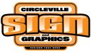
OK....After much work....
- Thread starter Circleville Signs
- Start date
Jillbeans
New Member
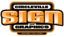
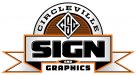
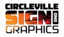
I agree with Bruce.^^^ None are all that. The first one is OK, the others are not. The last one is just plain too hard to read. With a long name like Circleville, and there's nothing wrong with it, it kind of limits you as to what exactly you can do with your logo.
I think maybe if you really under-emphasized the name and pumped up the signs and graphics part you would be on a roll. I think you need to give up the big circle entirely.
Here's a really simple suggestion.
Love....Jill
I think maybe if you really under-emphasized the name and pumped up the signs and graphics part you would be on a roll. I think you need to give up the big circle entirely.
Here's a really simple suggestion.
Love....Jill
Attachments

Circleville Signs
New Member
Thanks for the input folks! Colin, your first one is really cool! Jill, as always you are the best at turning simple into sweet ")
I'm talking to Phillip about possibly doing something for us. The challenge withthe long city name is the hard part. I really want to stay away from a horizontal format, as it totally limits what as can do from a design standpoint...On things like business cards, web, etc.
I'm talking to Phillip about possibly doing something for us. The challenge withthe long city name is the hard part. I really want to stay away from a horizontal format, as it totally limits what as can do from a design standpoint...On things like business cards, web, etc.
jfiscus
Rap Master
What is your opinion of 99% of the logos that customers bring into your shop that they created their selves?
Got your answer? Ok, that is why you do not design your own logo.
Doing work for someone else always seems to turn out better than your own imho.
I think after getting some input here or elsewhere you may be able to tweak it so that it's more "your" style, but I would definitely consider hiring an outside eye to handle this project.
Colin
New Member
I really want to stay away from a horizontal format, as it totally limits what as can do from a design standpoint.
Which is why I generally try to incorporate some flexibility into my logos, so they can be set up in different ways.
Attachments

Colin
New Member
That is sweet, Collins. I could see there was an S. in the graphic. But it looks like there's a G in their somewhere to.
Is there?
It does look cool.
Umm, no, it's "c". A "c" and an "s".

SignManiac
New Member
 Colin that last one is really good
SignManiac
New Member


Dave Drane
New Member
i like it, it makes me want to smoke a fat joint and listen to some records while sitting in a bean bag with my bell bottoms on. Groovy
the original looks the most modern though.

rjpjr
New Member
Agreed... Your company name is a challenge!The challenge with the long city name is the hard part.
Attachments


Circleville Signs
New Member
Working on another idea now - John Butto gave me the idea - now I just have to refine it. Interested to see everyone's thoughts when I finish it. Also, Colin - stop using up EVERY good idea for my name!!!! lol...
Circleville Signs
New Member

Circleville Signs
New Member
I was playing Colin - i was playing