-
I want to thank all the members that have upgraded your accounts. I truly appreciate your support of the site monetarily. Supporting the site keeps this site up and running as a lot of work daily goes on behind the scenes. Click to Support Signs101 ...
You are using an out of date browser. It may not display this or other websites correctly.
You should upgrade or use an alternative browser.
You should upgrade or use an alternative browser.
Opinion on 2 versions of logo.
- Thread starter reQ
- Start date
reQ
New Member
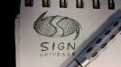
DONE!Take the concept of "sign" and "universe" and play with it some more and make sure it can fit within a box
Attachments

HDvinyl
Trump 2020
Gino
Premium Subscriber
I would start with something like this:
otherwise, the right side has more contrast and clarity and atleast the colors are exciting
Your kerning is seriously off. By the way, what font is that ??
Rick
Certified Enneadecagon Designer
I would start with something like this:
otherwise, the right side has more contrast and clarity and atleast the colors are exciting
This is a good start...
the logos shown have too much going on, I think a simple - memorable logo and let the marketing materials do the talking....
When I say this I was doodling a character for a logo I'm working on and thought this looked familiar...
Attachments
Rebel Graphics
New Member
To me, all logos should be created as vectors and make sure it can work as a black and white.
Anybody can throw a bunch of photoshop effects to a font and call it a logo
Anybody can throw a bunch of photoshop effects to a font and call it a logo
Jwalk
New Member
If I had to hit the ground running and couldn't change a thing I would go with yours. The left one as everyone else has said the universe is way to dark. I do think yours is fragmented with the planet and your type. Almost two different pieces.
Both are worthy if you played with them a tiny bit.
Both are worthy if you played with them a tiny bit.
GaSouthpaw
Profane and profane accessories.
I would start with something like this:
otherwise, the right side has more contrast and clarity and atleast the colors are exciting
I thought the one on the left was an ad for the new "Hunger Games" movie.
If a galaxy/planet is what the icon is supposed to call to mind, I could only suggest making it look a tad more similar to those elements. This sketch has given you a great jumping off point.