-
I want to thank all the members that have upgraded your accounts. I truly appreciate your support of the site monetarily. Supporting the site keeps this site up and running as a lot of work daily goes on behind the scenes. Click to Support Signs101 ...
You are using an out of date browser. It may not display this or other websites correctly.
You should upgrade or use an alternative browser.
You should upgrade or use an alternative browser.
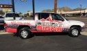
Our company van wrap design - Go ahead, tear it apart
- Thread starter SignProPlus-Chip
- Start date
rjssigns
Active Member
RJ, no offense, but that looks like an autopsied ribcage revealing the lungs.
No offense taken. Your comment made me laugh. Never thought about the autopsy angle. The Juice Drops I have are pretty wild. Here's a pic of the almost completed "digger".
Please excuse the watermark. It is from our web content.
Attachments

rjssigns
Active Member
I thought it was an enlarged section of a torso too at first glance. That turned out really good on the dragster.
Ha! A torso. Between you and JillBeans my wife is:ROFLMAO: Which got me :ROFLMAO:
Thanks for the compliment.
Pat Whatley
New Member
My first thought was "Why did somebody post a picture of a gutted deer?"RJ, no offense, but that looks like an autopsied ribcage revealing the lungs.
OldPaint
New Member
my 1st thought was a colored version of.......
https://www.google.com/search?q=gig...7IJbYoASmsYLYBQ&ved=0CCEQsAQ&biw=1276&bih=633
https://www.google.com/search?q=gig...7IJbYoASmsYLYBQ&ved=0CCEQsAQ&biw=1276&bih=633
Desert_Signs
New Member
Since we're at it, Id like to hear what you have to say about mine. I have a thick skin, so, fire away. 
The entire wrap is matte with the logo only laid on top in gloss.
The entire wrap is matte with the logo only laid on top in gloss.
Attachments

Gino
Premium Subscriber
Not really too keen on it, at all. The blues and blacks, just don't do it for me and the flow kinda stumbles around for my taste. I totally don't like important or any information for that matter.... so low as your phone number. Completely takes you eye off the canvas. Now you've lost the audience. Not to mention, will always be dirty unless, you're a clean freak.
Lotsa wrong elements, if you're trying to create an eye catching 3 second wonder.
Lotsa wrong elements, if you're trying to create an eye catching 3 second wonder.
Gino
Premium Subscriber
Since we're at it, Id like to hear what you have to say about mine. I have a thick skin, so, fire away.
The entire wrap is matte with the logo only laid on top in gloss.
You should start your own thread, rather than
 this one.
After a while, it becomes confusing which poster is responding to which topic piece.
shoresigns
New Member
I'll be harsh but honest - you did say "go ahead, tear it apart" ") And I'll try to be helpful too...
And I'll try to be helpful too...
The colour scheme is not attractive at all. Try Adobe Color for some inspiration, or use the Color Guide panel in Illustrator to find complementing colours.
Too many textures and effects. Outlined text, blue pattern background, grey/white gradient background, brushed metal background. Simplify it, and if you want to show off something like metallic vinyl, put it on one element so it stands out, instead of the top 1/3 of the whole vehicle.
Also, the font in your logo is about as generic as you can get for a sign shop. That style is way too overdone (the square-ish letters like Eurostile/Microgramma etc.) and looks quite dated.
And I'll try to be helpful too...The colour scheme is not attractive at all. Try Adobe Color for some inspiration, or use the Color Guide panel in Illustrator to find complementing colours.
Too many textures and effects. Outlined text, blue pattern background, grey/white gradient background, brushed metal background. Simplify it, and if you want to show off something like metallic vinyl, put it on one element so it stands out, instead of the top 1/3 of the whole vehicle.
Also, the font in your logo is about as generic as you can get for a sign shop. That style is way too overdone (the square-ish letters like Eurostile/Microgramma etc.) and looks quite dated.
shibby
New Member
Since we're at it, Id like to hear what you have to say about mine. I have a thick skin, so, fire away.
The entire wrap is matte with the logo only laid on top in gloss.
Placement on the passenger's side really kills it for me, otherwise I like it (drivers side). Feel like the phone number and website are tilted just for the sake of matching the logo. Otherwise I think it looks sharp.
shoresigns
New Member
Since we're at it, Id like to hear what you have to say about mine. I have a thick skin, so, fire away.
The entire wrap is matte with the logo only laid on top in gloss.
See what I mean? Why do so many sign companies use the same type of fonts?
And why are there mountains if you're called Desert Signs?
Desert_Signs
New Member
See what I mean? Why do so many sign companies use the same type of fonts?
And why are there mountains if you're called Desert Signs?
On the fonts? I don't know, I guess we all like them, LOL.
There are mountains because there are lots of mountains in the desert.
Kentucky Wraps
Kentucky Wraps
Since we're at it, Id like to hear what you have to say about mine. I have a thick skin, so, fire away.
The entire wrap is matte with the logo only laid on top in gloss.
Looks good...but....on the driver side...either rotate it or don't. Sheesh.