-
I want to thank all the members that have upgraded your accounts. I truly appreciate your support of the site monetarily. Supporting the site keeps this site up and running as a lot of work daily goes on behind the scenes. Click to Support Signs101 ...
You are using an out of date browser. It may not display this or other websites correctly.
You should upgrade or use an alternative browser.
You should upgrade or use an alternative browser.
Retro Logo Design
- Thread starter Joe Diaz
- Start date


J Hill Designs
New Member
diggin it 
shoresigns
New Member
Looks fantastic, as always. I can offer some critique though:
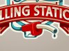
The Filling Station banner is way too big, and it's making the hierarchy unclear. Filling Station seems to be competing with Edinger's, and if they're famous (or they want to present themselves as such), then Edinger's should be top priority, not Filling Station - and they definitely shouldn't be both competing the way they are now.
The Filling Station banner is way too big, and it's making the hierarchy unclear. Filling Station seems to be competing with Edinger's, and if they're famous (or they want to present themselves as such), then Edinger's should be top priority, not Filling Station - and they definitely shouldn't be both competing the way they are now.
SignManiac
New Member
Like the color choices and overall layout. I think you could bump up the size of the pump handle a bit more so it becomes a little more obvious? Only minor tweaks but great design!
Joe Diaz
New Member
Looks fantastic, as always. I can offer some critique though:
The Filling Station banner is way too big, and it's making the hierarchy unclear. Filling Station seems to be competing with Edinger's, and if they're famous (or they want to present themselves as such), then Edinger's should be top priority, not Filling Station - and they definitely shouldn't be both competing the way they are now.
Actually in this case they specifically requested that we make "Filling Station" larger and more prominent. In fact, one of the earlier alternate sketches had "Edinger's" Much larger. Locally they wish to be known as "Filling Station" not just "Edinger's" and not even so much "Edinger's Filling Station" I think the Edinger's is their way of differentiating themselves from other places around the country also called "Filling Station", but since the majority of their market is local this was their decision, which I support. I guess my point is, this all was discussed, I do appreciate the advice though.
Joe Diaz
New Member
Looks great Joe!
There was a Filling Station a few miles from here...they used the red Texaco looking pegasus in their artwork.
Wasn't the Pegasus for Mobil? I thought Texaco was a star. Anyway was the place you were talking about an actually gas station, or was it a restaurant?
The place I'm working on right now is an old automotive/gas station themed restaurant. In fact the front of the building is going to sort of look like a garage, and the inside is going to themed the same way. The local Pontiac museum is going to help decorate the place with part of their collection since they have so much stuff and not enough room to display it all in their building. It should be really cool.
I would have liked to put a bit more of an emphasis on the restaurant part. An earlier concept had a chef hat incorporated into the design rather than the silverware, but I think this will work great regardless.
graphicwarning
New Member
I wish I had the creativity to be able to come up with stuff like this! Very nice work!
The only one thing that caught my eye though, and I can't say why I noticed it because it is really a trivial point… but the shadow on the tail of the S and the banner suggests the “light source” would be top center. Having said that, I’m curious why there would be a shadow at the top of the gas nozzle/handle. I see the necessity to separate the similar colors, but it just jumped out to me.
I'm not suggesting it be changed, I’m just curious if there was a thought process behind that, and if there was… I’m curious why? Or did it just end up that way?
Don't mind me… I’m just rambling!
Joe Diaz
New Member
I wish I had the creativity to be able to come up with stuff like this! Very nice work!
The only one thing that caught my eye though, and I can't say why I noticed it because it is really a trivial point… but the shadow on the tail of the S and the banner suggests the “light source” would be top center. Having said that, I’m curious why there would be a shadow at the top of the gas nozzle/handle. I see the necessity to separate the similar colors, but it just jumped out to me.
I'm not suggesting it be changed, I’m just curious if there was a thought process behind that, and if there was… I’m curious why? Or did it just end up that way?
Don't mind me… I’m just rambling!
It doesn't have to be there, and it wasn't at first, but it needed something to pull it away from that background graphic. It's not horrible without that shadow, but it gives it the illusion that it's popping forward a bit and makes the pump a little easier to make out. But you are right it definitely isn't natural. It does help though.
ForgeInc
New Member
I wish I had the creativity to be able to come up with stuff like this! Very nice work!
The only one thing that caught my eye though, and I can't say why I noticed it because it is really a trivial point… but the shadow on the tail of the S and the banner suggests the “light source” would be top center. Having said that, I’m curious why there would be a shadow at the top of the gas nozzle/handle. I see the necessity to separate the similar colors, but it just jumped out to me.
I'm not suggesting it be changed, I’m just curious if there was a thought process behind that, and if there was… I’m curious why? Or did it just end up that way?
Don't mind me… I’m just rambling!
Love it Joe!
I would agree with this feedback, not sure that those extra tiny bits of shadow right above the pump handle are necessary, but vers. 1 is solid. It's great seeing the breadth and range of styles you have...
Pixels Are Bad Mmmkay?
New Member
I agree about the nozzle shadow looking unnatural. I would suggest a slight shadow running across the top length of the nozzle. Nozzles are slightly shiny and shiny things reflect things around them so you can get away with it.
Another suggestion would be to outline the nozzle/pump handle with a dark blue outline that tapers away somewhere between the pump handle and where the hose falls behind the ribbon. This will give a stronger feeling of depth and will eliminate said shadow. In case my explanation doesn't make sense, I will illustrate.
Another suggestion would be to outline the nozzle/pump handle with a dark blue outline that tapers away somewhere between the pump handle and where the hose falls behind the ribbon. This will give a stronger feeling of depth and will eliminate said shadow. In case my explanation doesn't make sense, I will illustrate.
Attachments
artofacks1
New Member
Good design, good concept... The filling station text is secondary and should be about 60 to 75% of the name